
| [Enter Site Fig.]1234 Echo Brut 01 | 1234 Echo Brut 01, Drum Kits Sculpture (Isolated Module) | 3Dim Slab Sets 1 Copy |
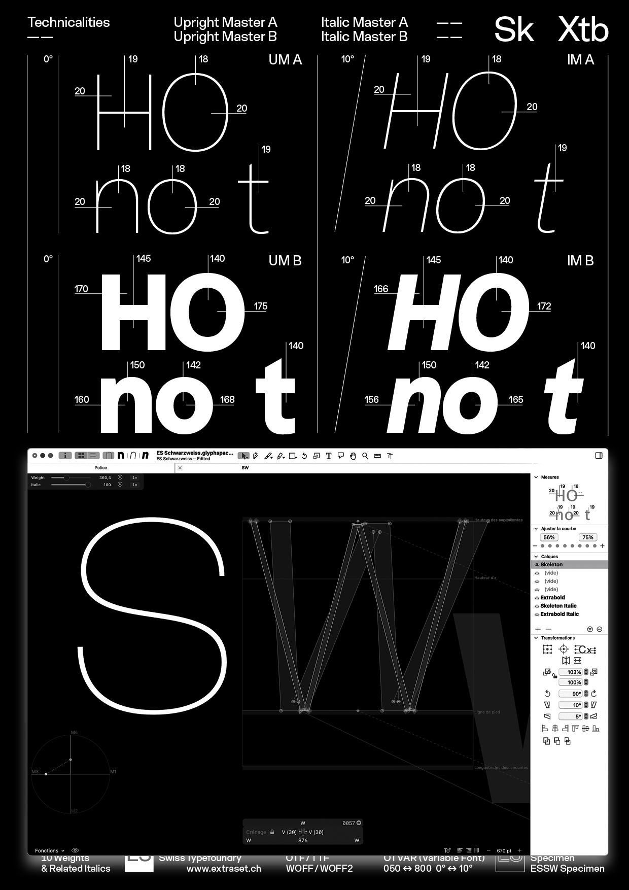
| ES Schwarzweiss Typeface and Printed Specimen, 2026
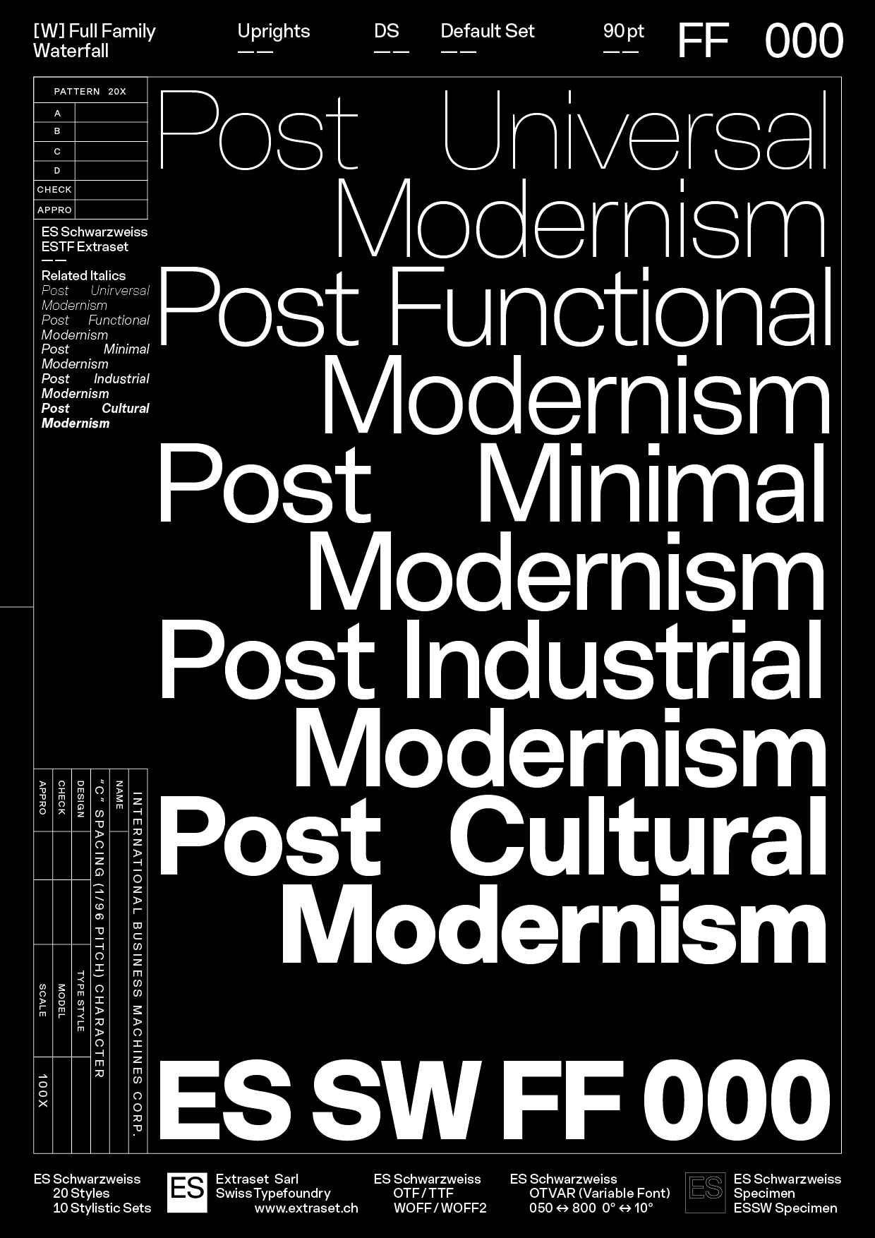
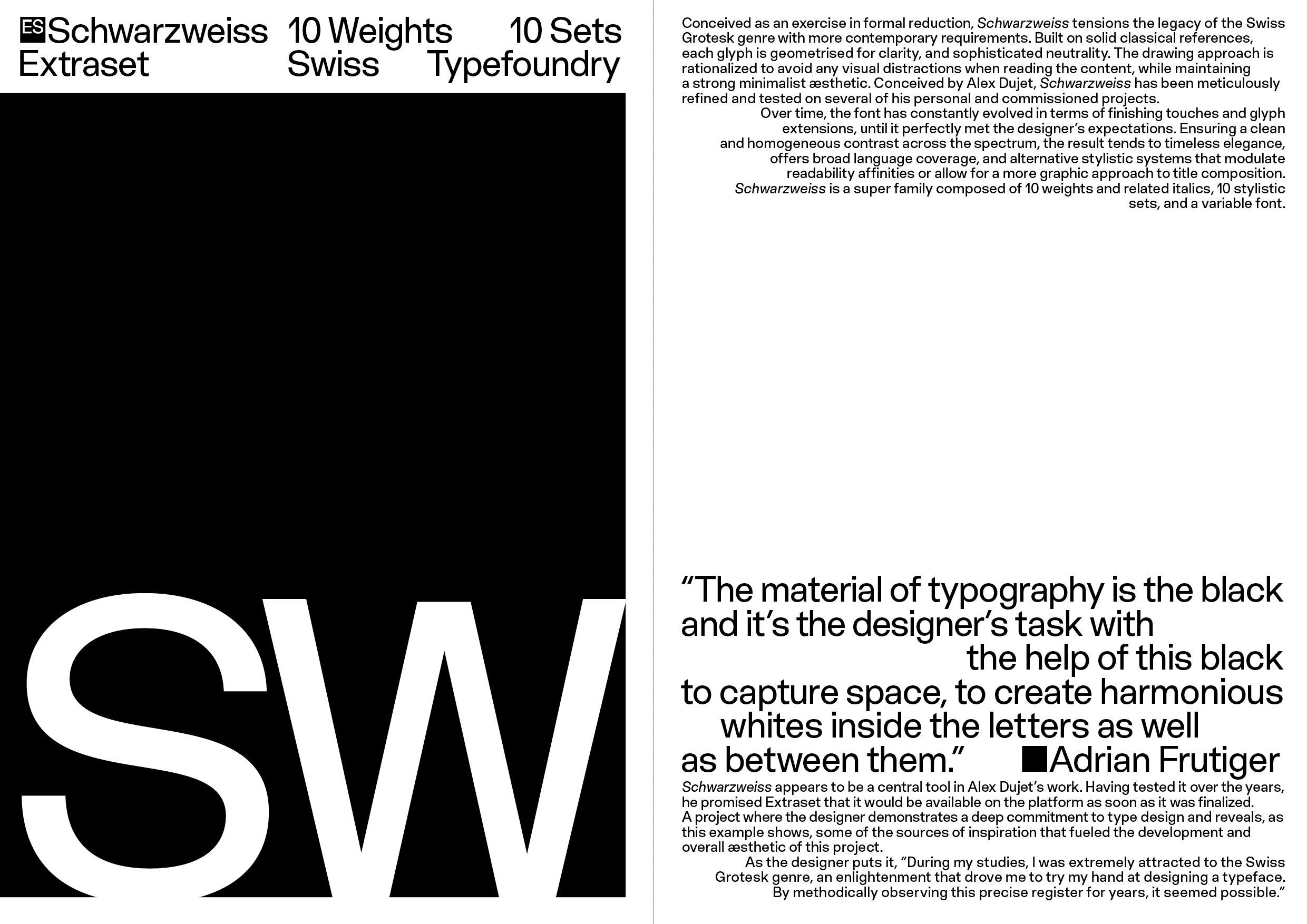
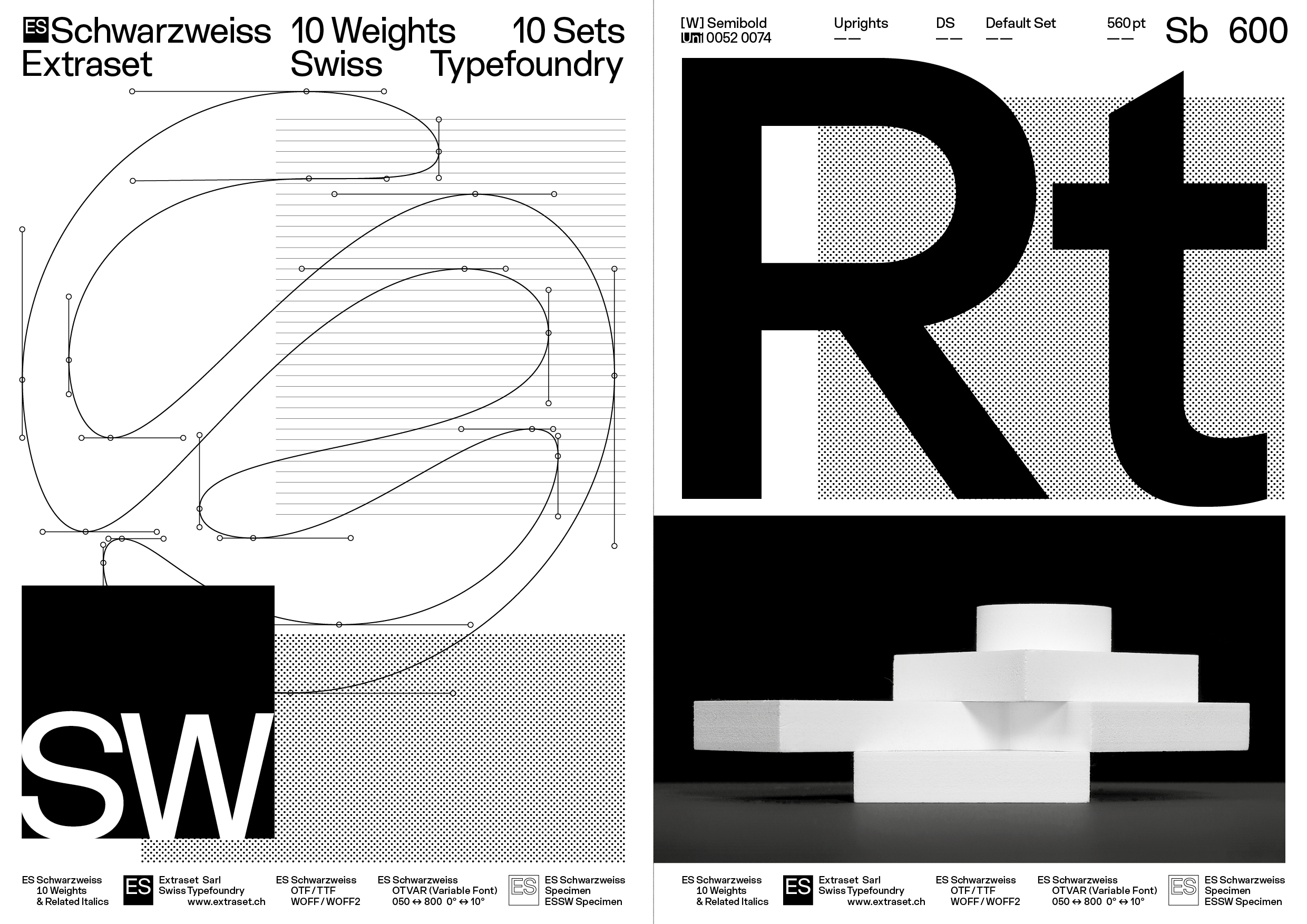
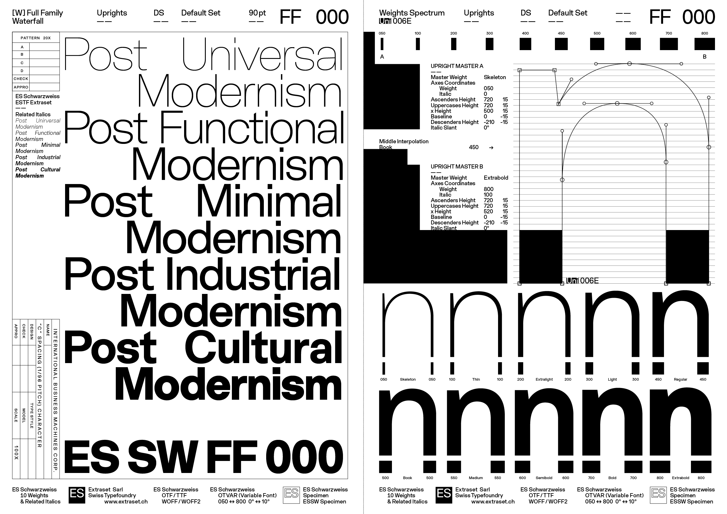
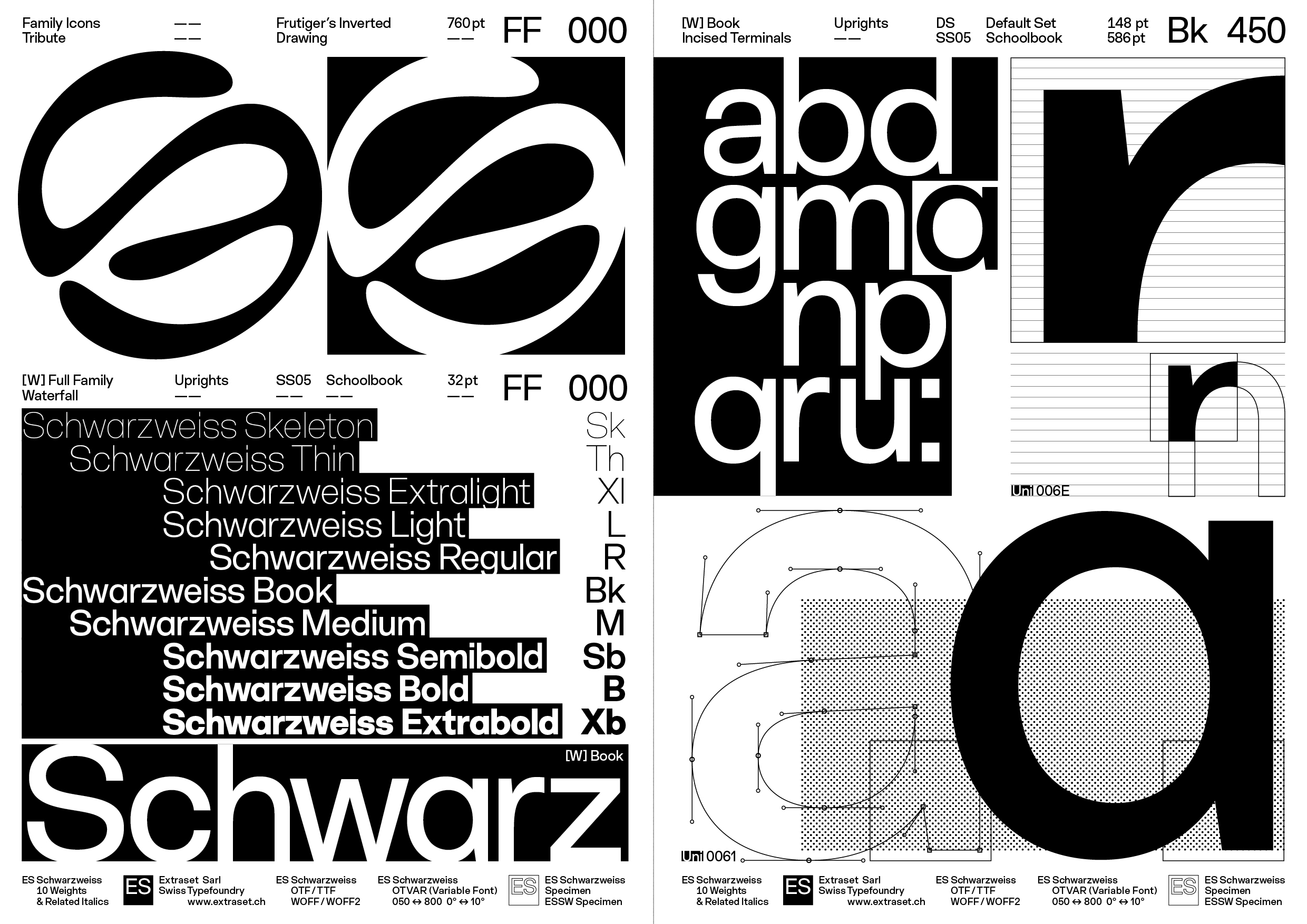
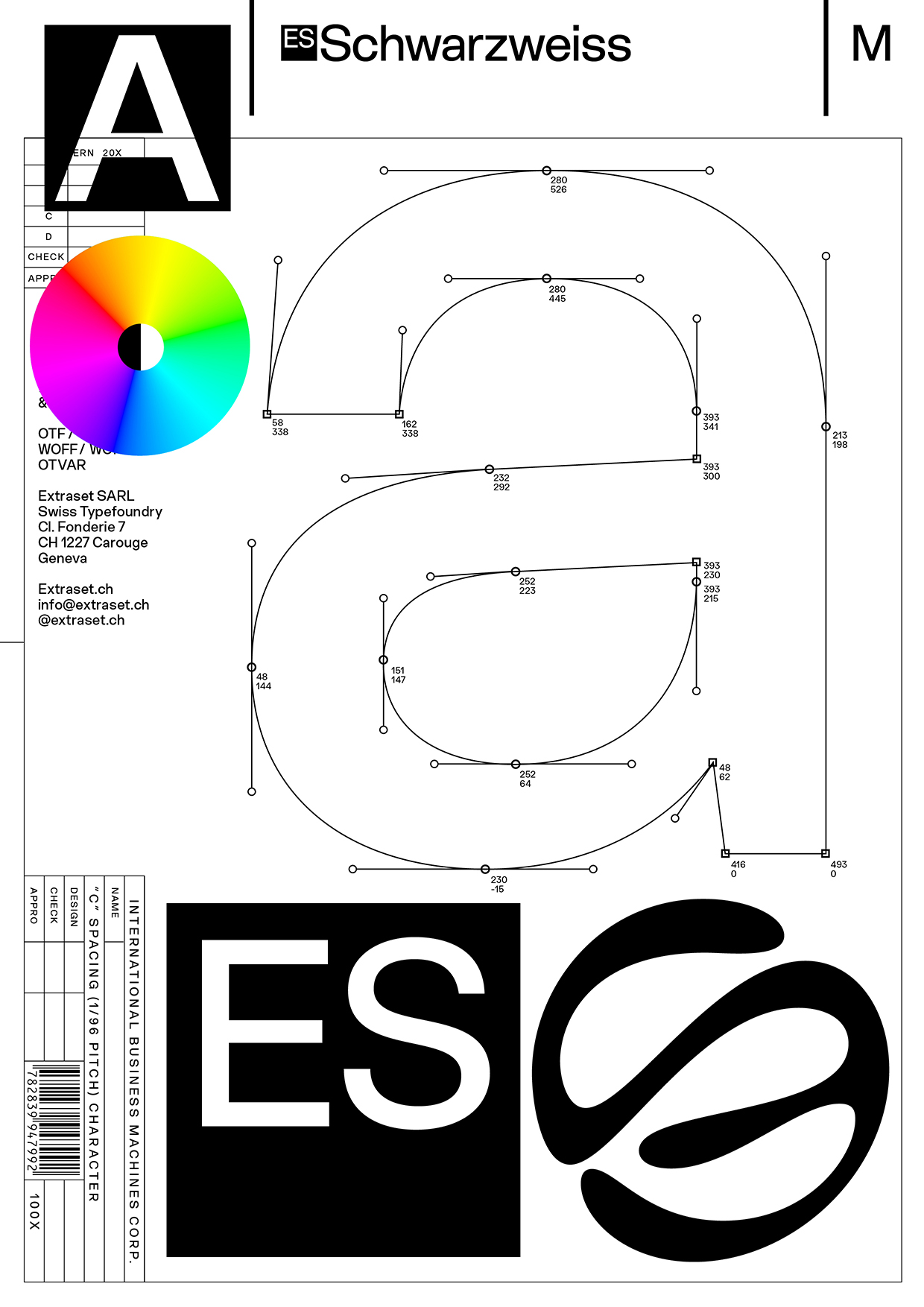
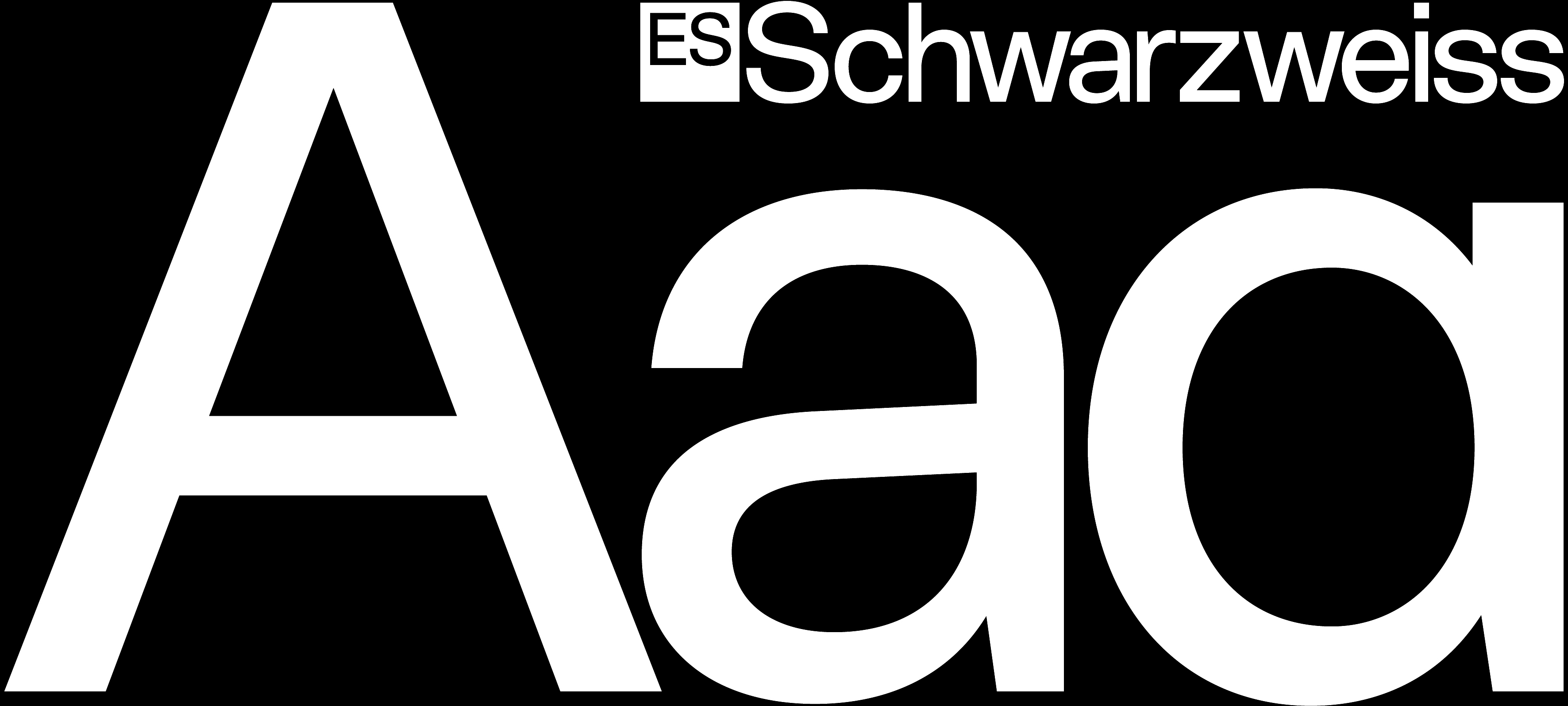
Conceived as an exercise in formal reduction, Schwarzweiss tensions the legacy of the Swiss Grotesk genre with more contemporary requirements. Built on solid classical references, each glyph is designed for clarity, and sophisticated neutrality. The drawing approach is rationalized to avoid any visual distractions when reading the content, while maintaining a strong minimalist æsthetic. |
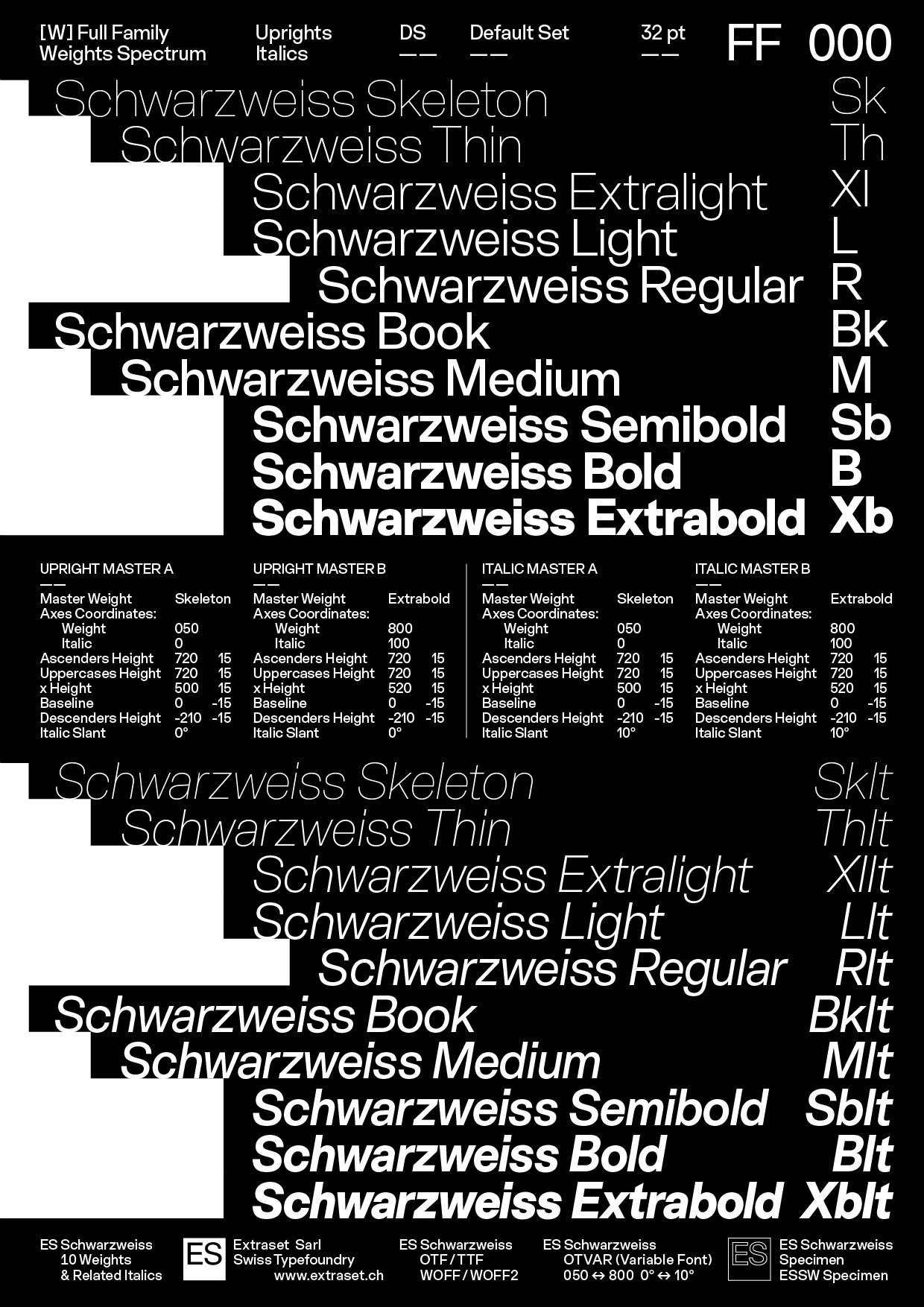
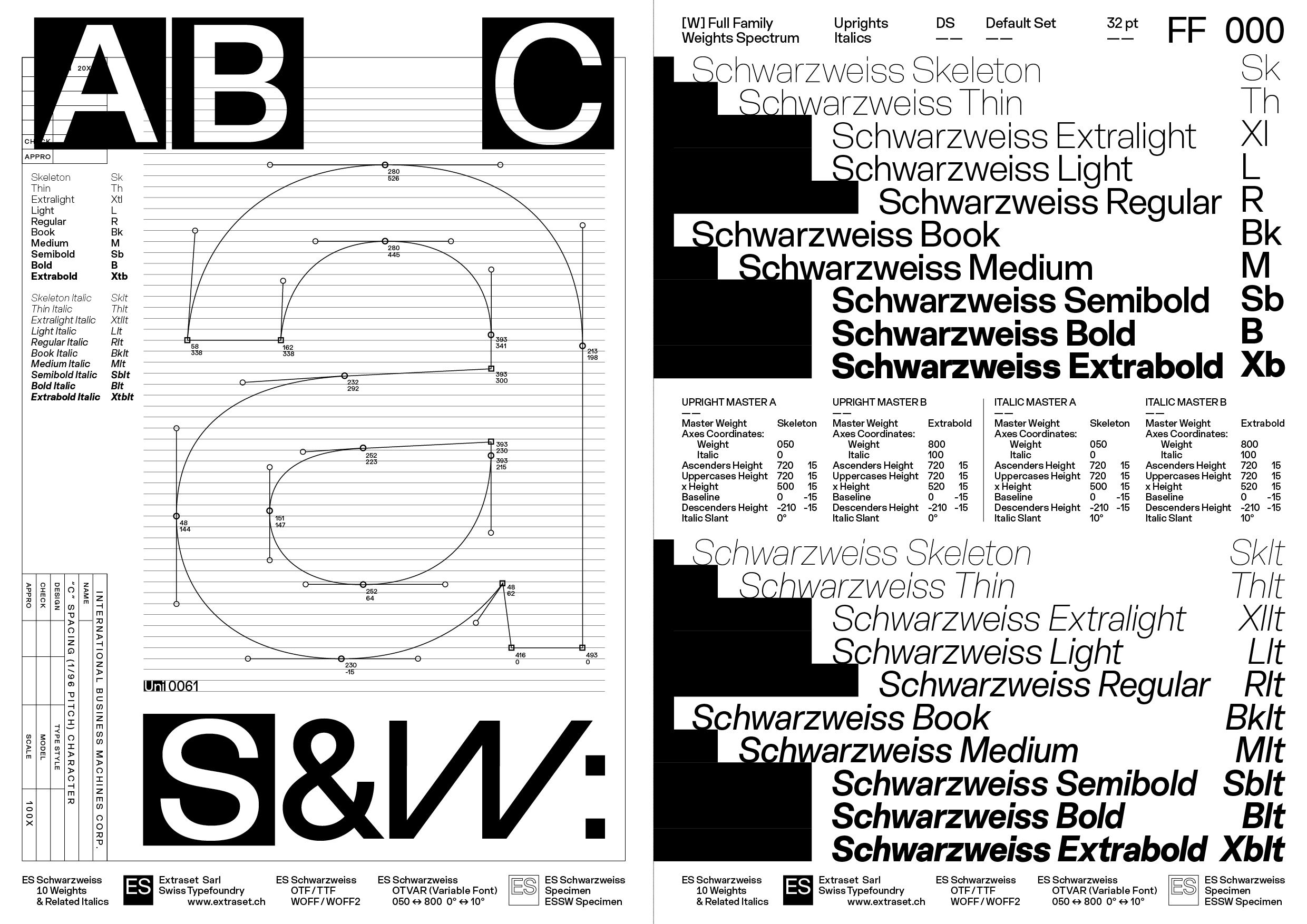
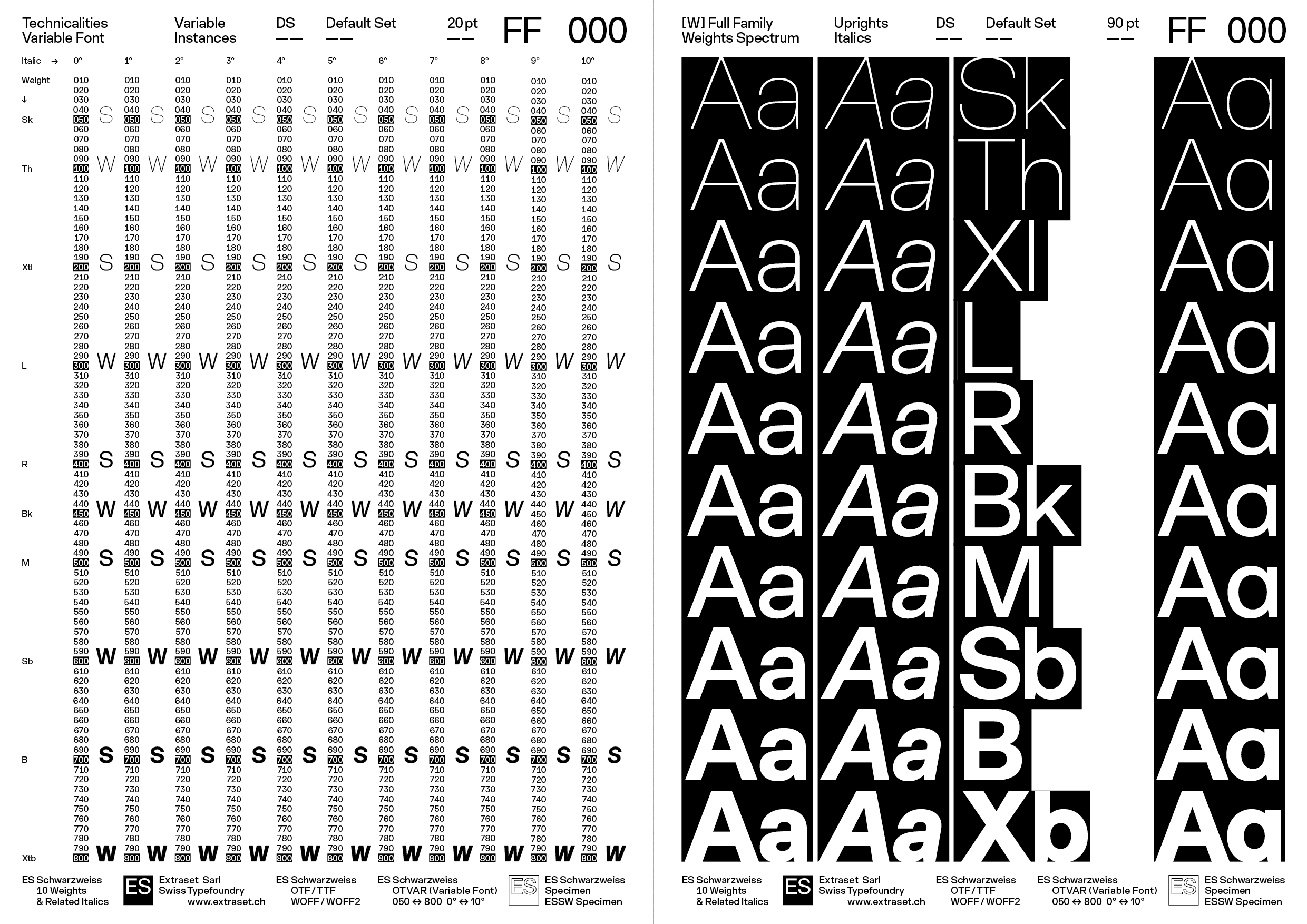
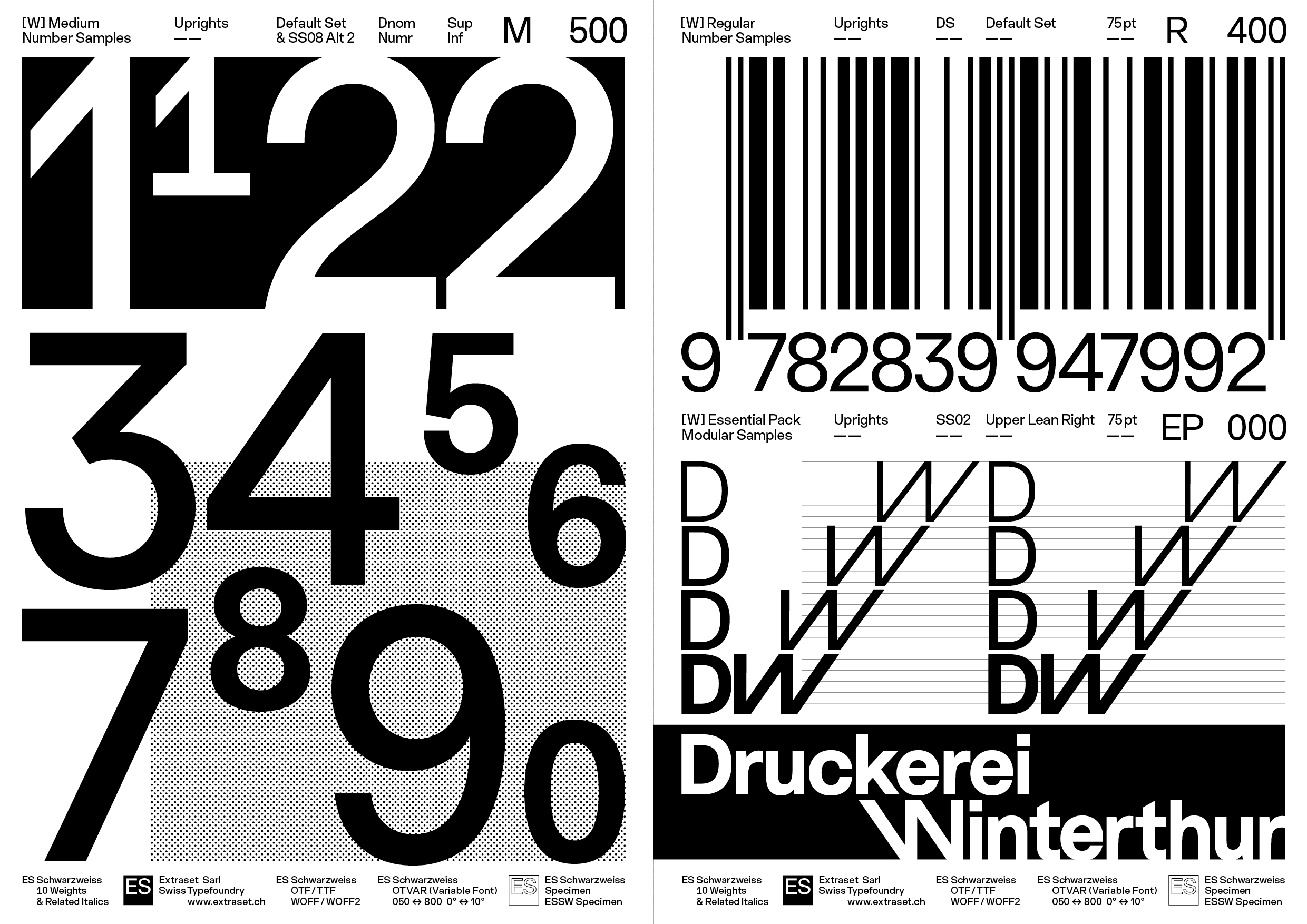
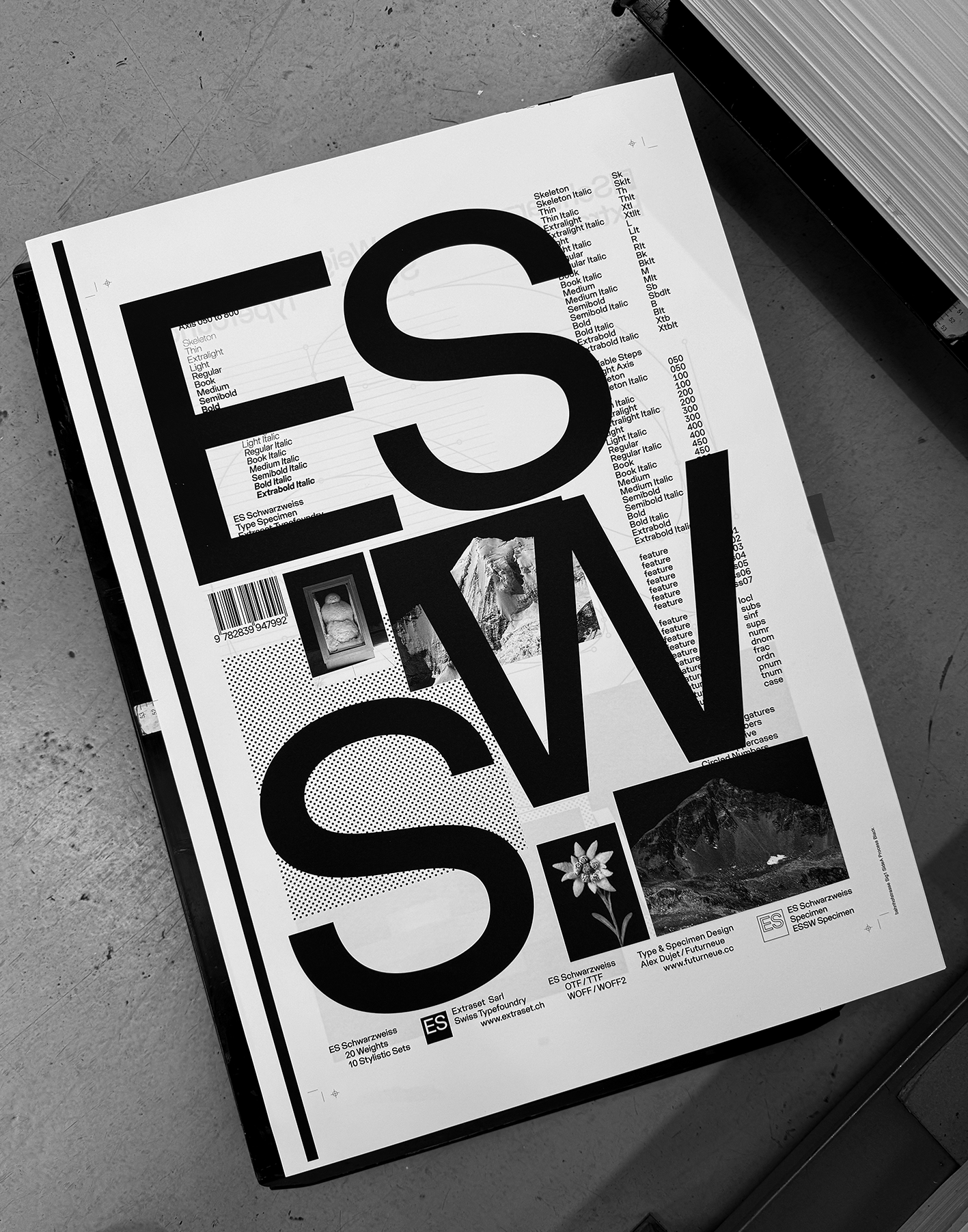
Conceived by Alex Dujet, Schwarzweiss has been meticulously refined and tested on several of his personal and commissioned projects. Over time, the font has constantly evolved in terms of finishing touches and glyph extensions, until it perfectly met the designer’s expectations. Ensuring a clean and homogeneous contrast across the spectrum, the result tends to timeless elegance, offers broad language coverage, and alternative stylistic systems that modulate readability affinities or allow for a more graphic approach to title composition. | Schwarzweiss is a font family composed of 10 weights and related italics, 10 stylistic sets, and a variable font. A printed specimen is also available by following the links below.
Typeface Distributor: Extraset Swiss Type Foundry, SARL. Specimen Distributor: Extraset Swiss Type Foundry, SARL. |
| ES Schwarzweiss Specimen | [Left Fig.] Specimen Cover, Format 210 x 297 mm, 32 Pages | Offset PrintingPrint-run 300 Copies |
|
|
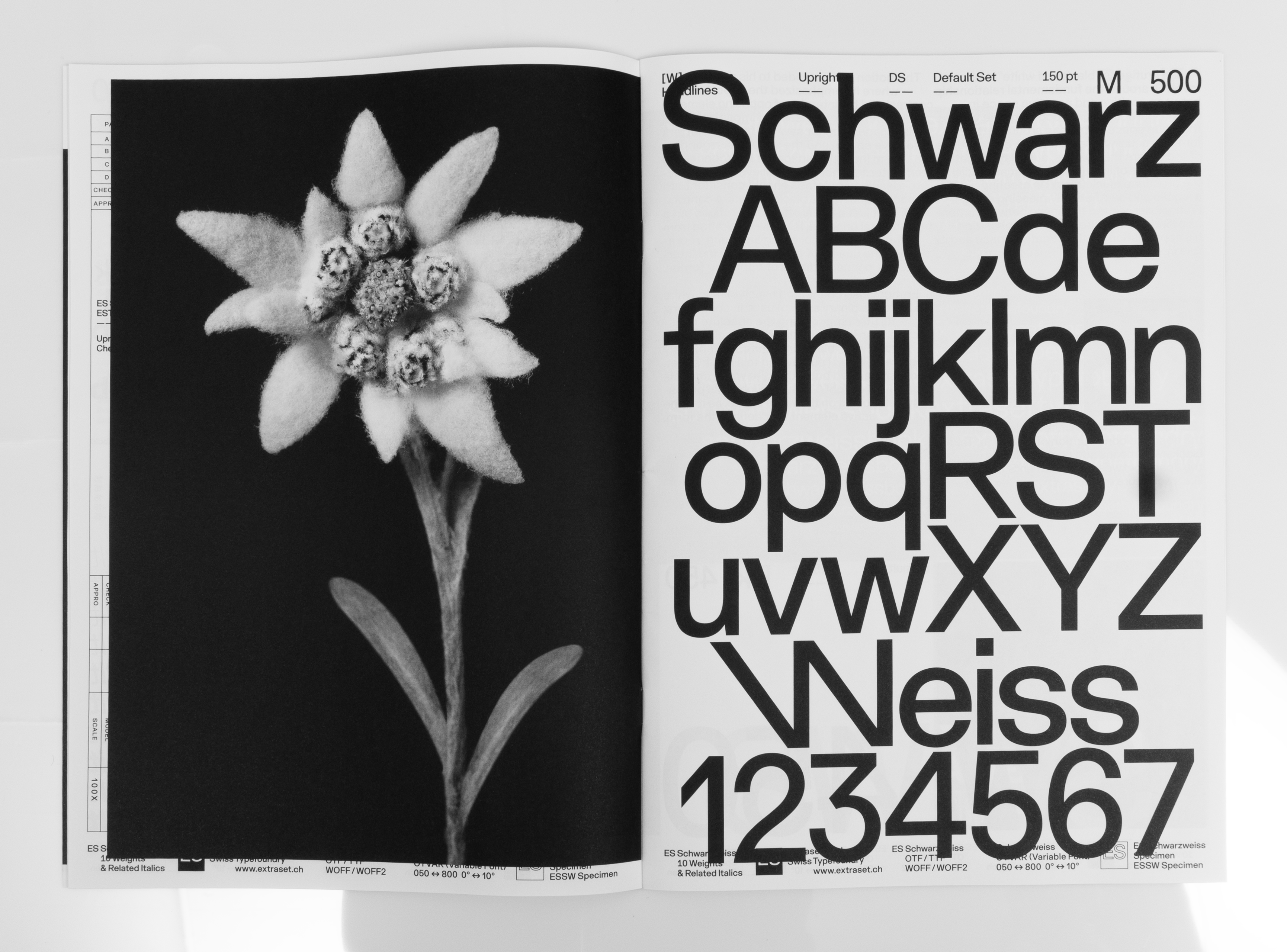 |
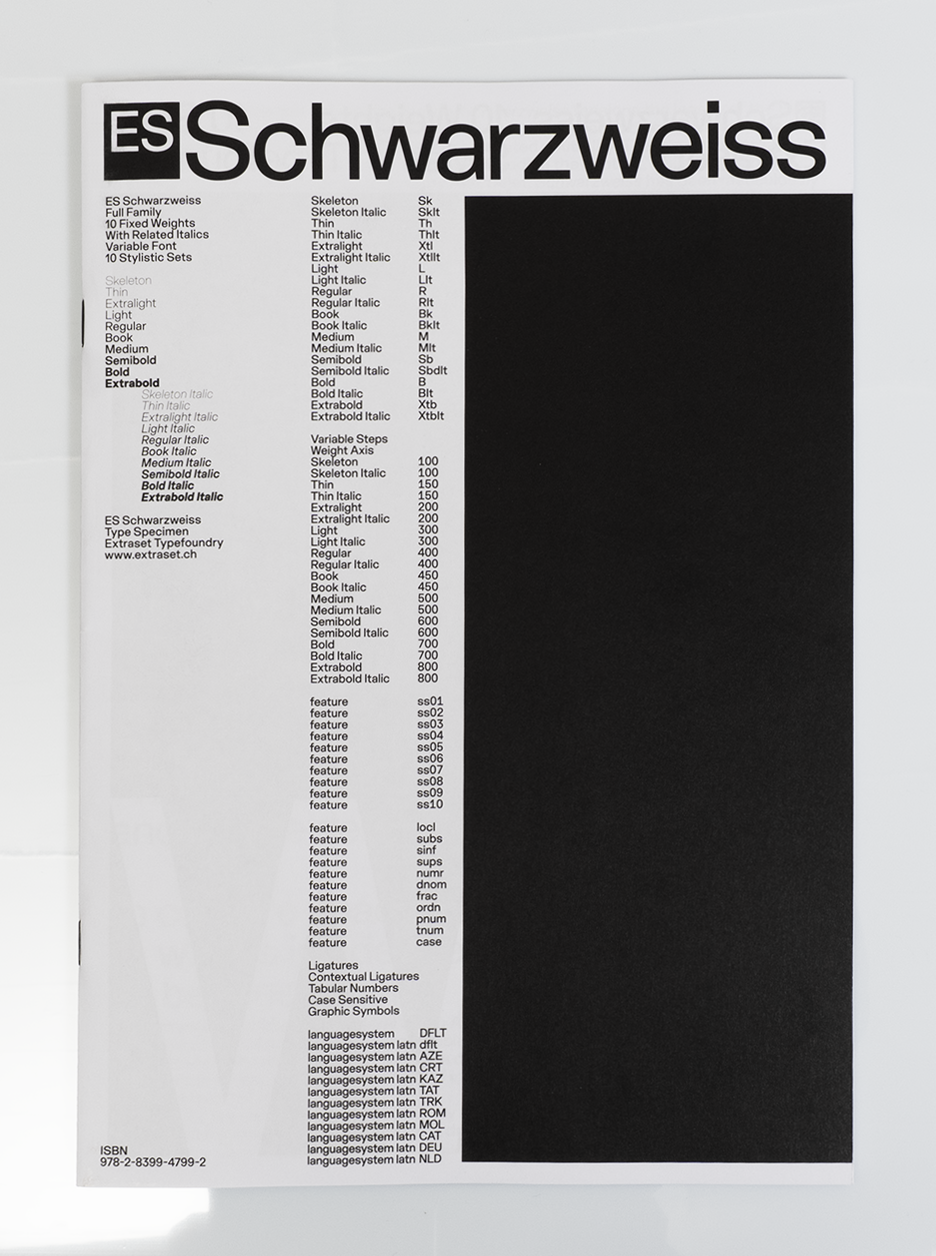
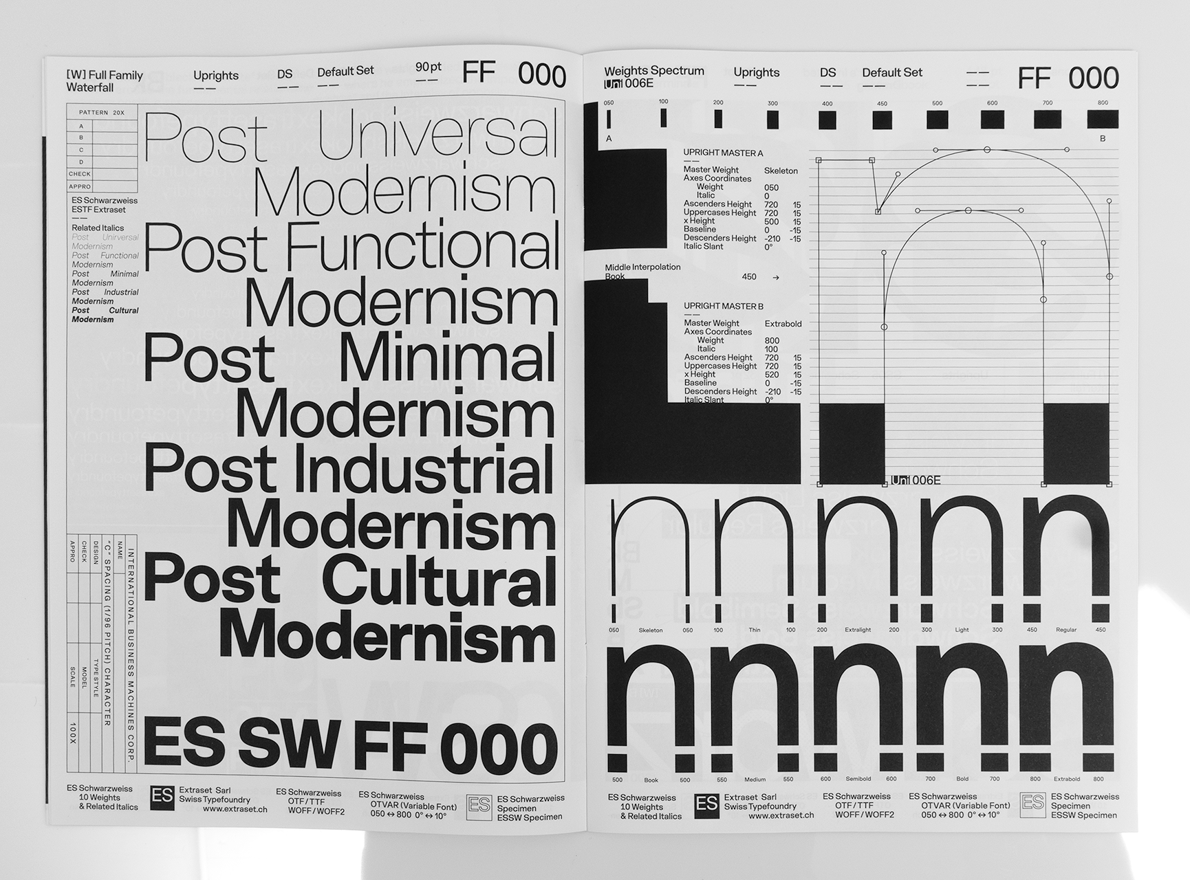
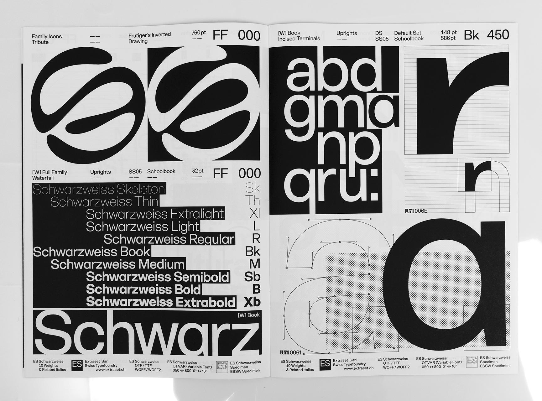
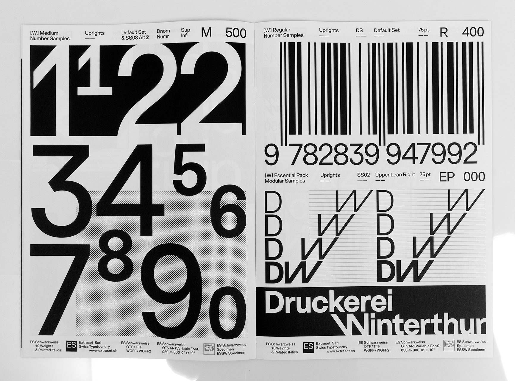
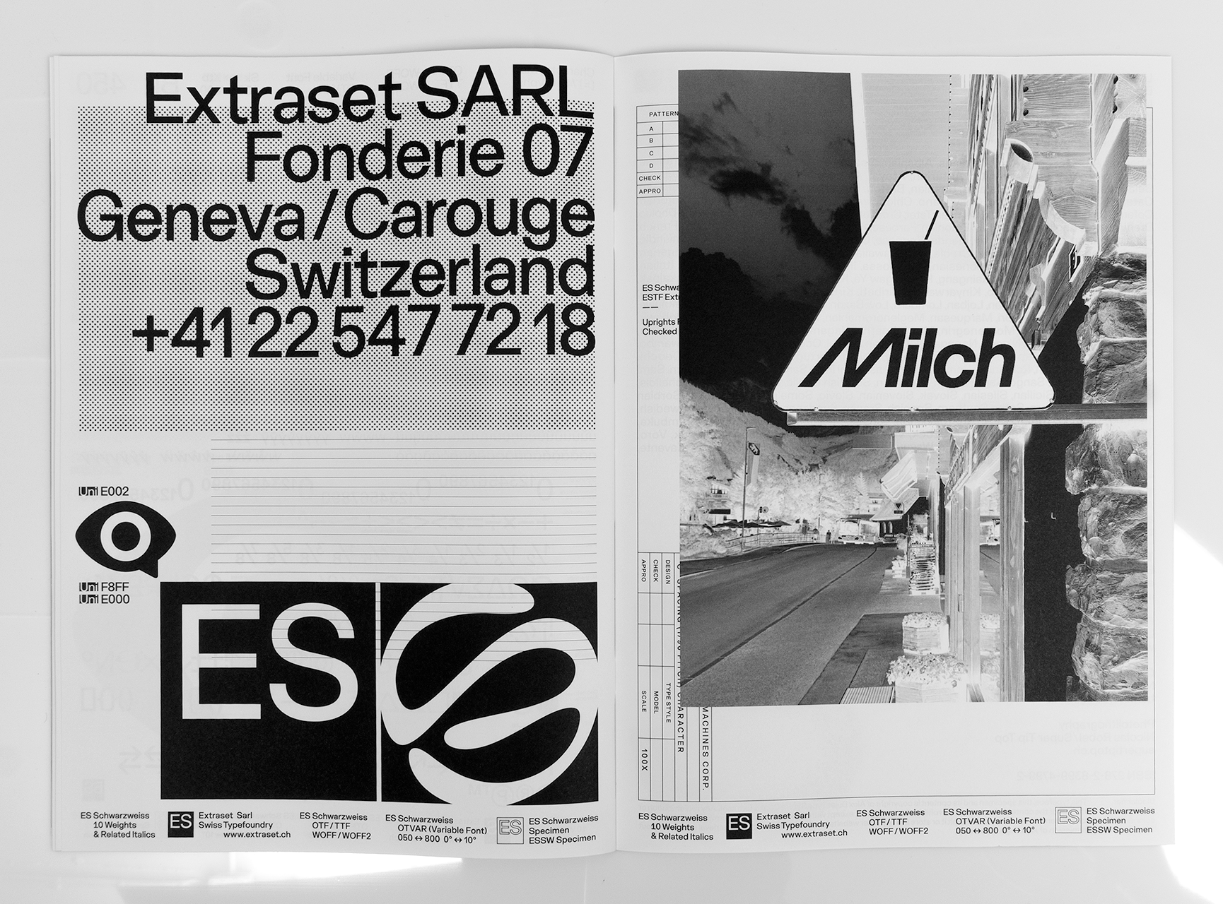
| ES Schwarzweiss Specimen | [Right Fig.] Specimen, Format 210 x 297 mm, 32 Pages | Offset PrintingPrint-run 300 Copies |
 |
 |
 |
| ES Schwarzweiss Type Design | 10 Weights + Related Italics, 10 Stylistic Sets | OTF TTF WOFF WOFF2OTVar Variable Font |
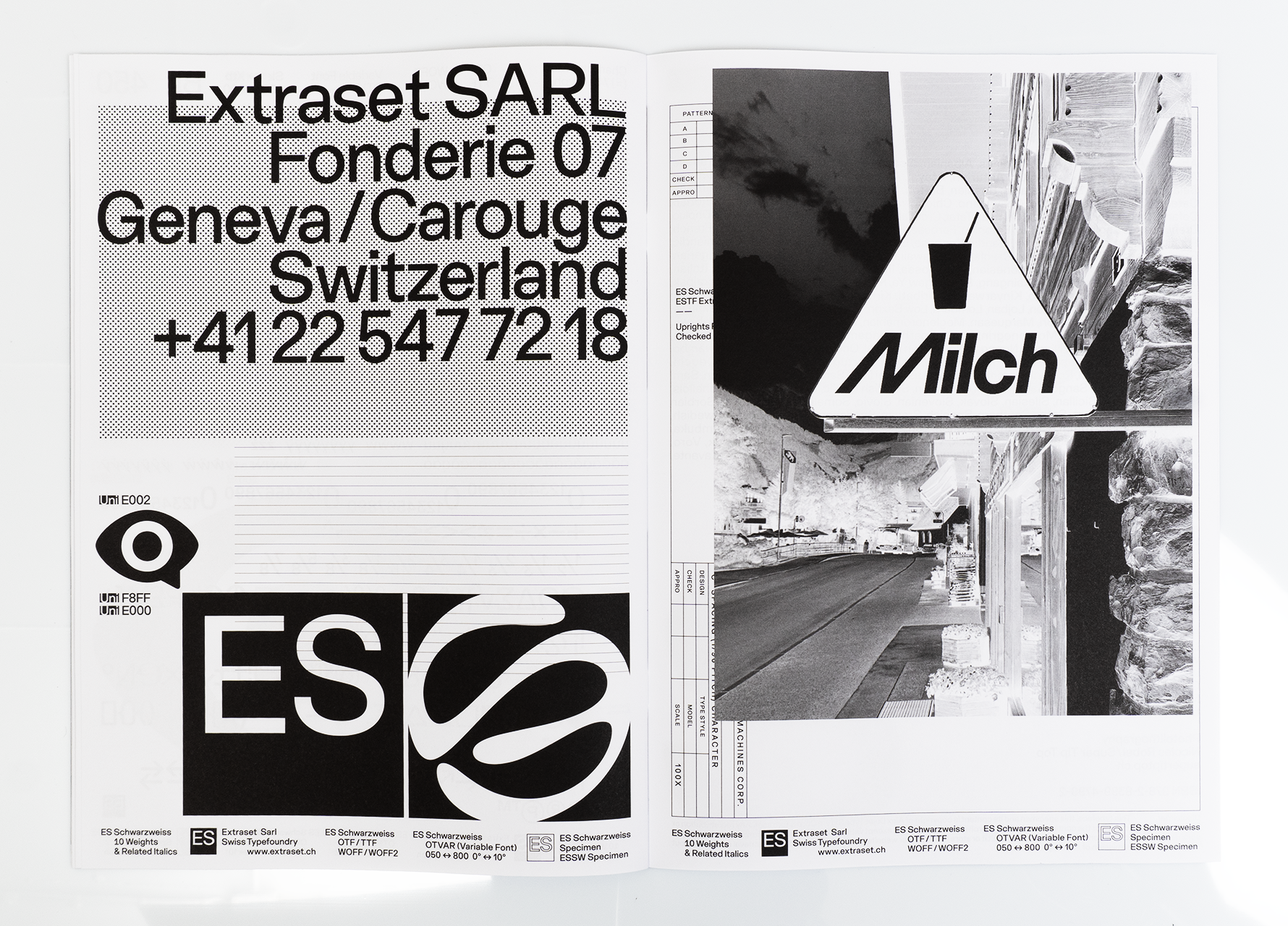
| ES Schwarzweiss Specimen | Softcover Specimen, Format 210 x 297 mm, 32 Pages | Offset PrintingPrint-run 300 Copies |
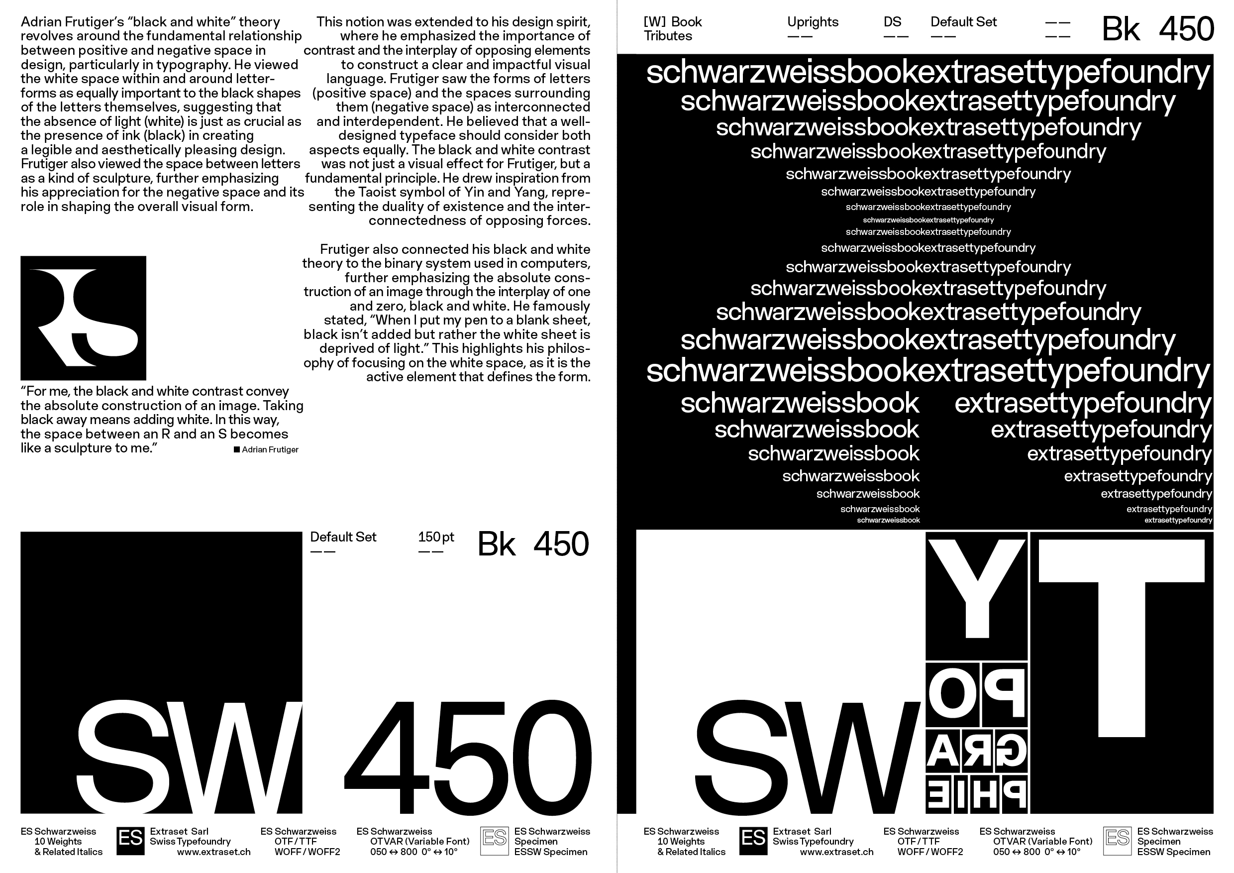
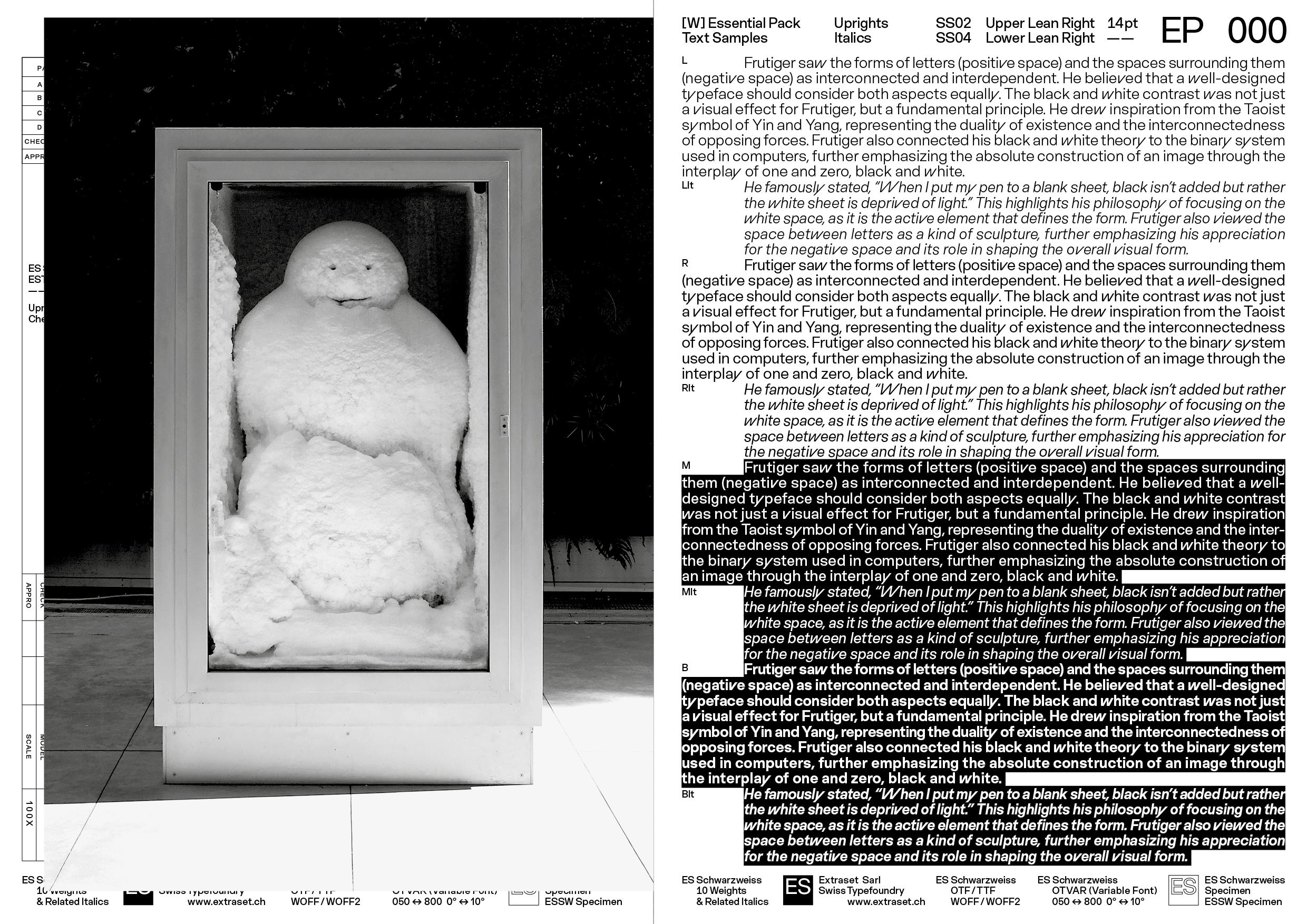
| Adrian Frutiger’s “black and white” theory revolves around the fundamental relationship between positive and negative space in design, particularly in typography. He viewed the white space within and around letter-forms as equally important to the black shapes of the letters themselves, suggesting that the absence of light (white) is just as crucial as the presence of ink (black) in creating a legible and aesthetically pleasing design. Frutiger also viewed the space between letters as a kind of sculpture, further emphasizing his appreciation for the negative space and its role in shaping the overall visual form. | This notion was extended to his design spirit, where he emphasized the importance of contrast and the interplay of opposing elements to construct a clear and impactful visual language. Frutiger saw the forms of letters (positive space) and the spaces surrounding them (negative space) as interconnected and interdependent. He believed that a well-designed typeface should consider both aspects equally. The black and white contrast was not just a visual effect for Frutiger, but a fundamental principle. He drew inspiration from the Taoist symbol of Yin and Yang, representing the duality of existence and the interconnectedness of opposing forces. | Frutiger also connected his black and white theory to the binary system used in computers, further emphasizing the absolute construction of an image through the interplay of one and zero, black and white. He famously stated, “When I put my pen to a blank sheet, black isn’t added but rather the white sheet is deprived of light.” This highlights his philosophy of focusing on the white space, as it is the active element that defines the form. |
| ES Schwarzweiss Specimen | Specimen's Extract, Adrian Frutiger's Black & White Theory | Offset PrintingPrint-run 300 Copies |
 |
 |
 |
 |
 |
 |
 |
 |
 |
| ES Schwarzweiss Specimen | Softcover Specimen, Format 210 x 297 mm, 32 Pages | Offset PrintingPrint-run 300 Copies |
|
|
| ES Schwarzweiss Type Design | 10 Weights + Related Italics, 10 Stylistic Sets | OTF TTF WOFF WOFF2OTVar Variable Font |
| ES Schwarzweiss Type Design | 10 Weights + Related Italics, 10 Stylistic Sets | OTF TTF WOFF WOFF2OTVar Variable Font |
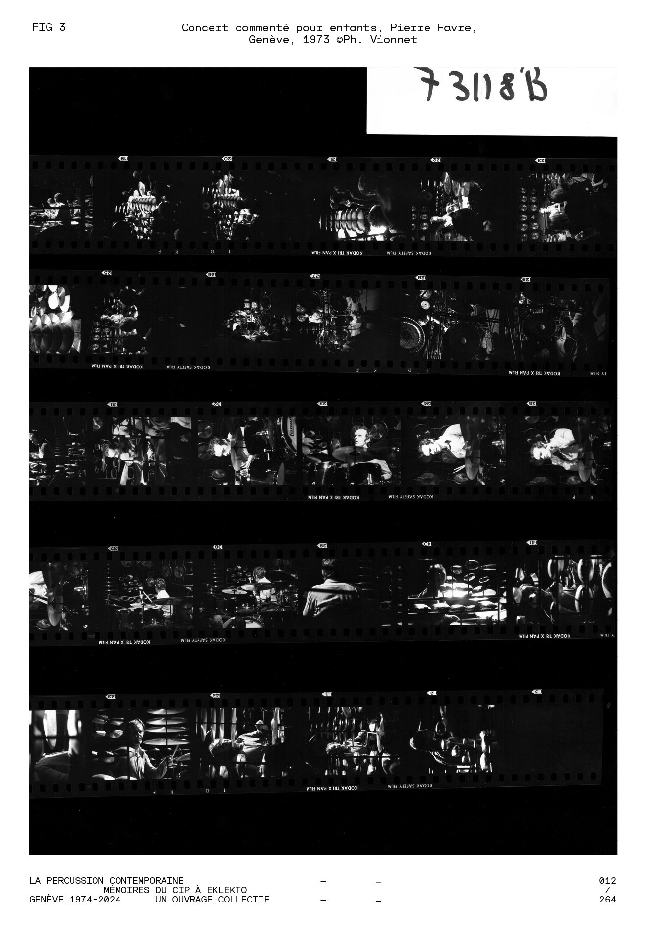
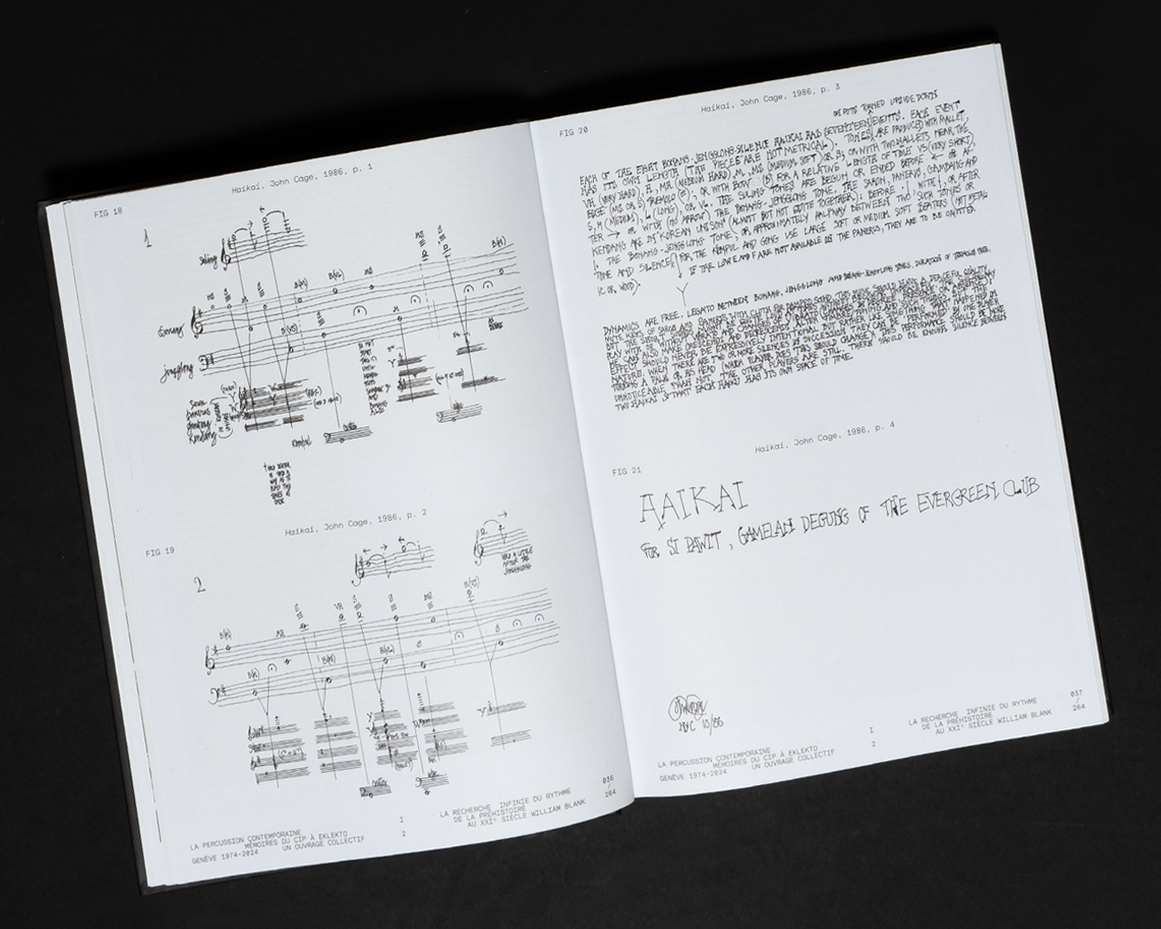
| La Percussion Contemporaine, Mémoires du CIP à Eklekto Genève 1974-2024, Un Ouvrage Collectif, 2024 This publication was created collectively to celebrate fifty years of activity of a renowned Geneva-based institution, Eklekto Geneva Percussion Center, formerly known as the Centre International de Percussion (CIP). Conceived as both a tribute and a historical reflection, the book brings together voices from across generations, musicians, collaborators, students, and close partners who have contributed to shaping the institution’s identity over the decades. |
Centered around the portrait of a singular musical journey — shaped by exceptional human relationships and a deep passion for the discipline — the book also outlines the emergence of inclusive sonic developments that have redefined percussion in recent years. Contemporary percussion in Geneva is revealed as an avant-garde cradle of a field once primarily associated with the orchestra, now evolving into an autonomous artistic practice. Through the plurality of historical instruments originating from distant cultures and traditions, both craftsmanship and technique are elevated and transformed. | This multifaceted portrait, woven from previously unpublished testimonies, reveals the metamorphosis of the percussionist’s role, now elevated to that of a fully-fledged stage performer.
Client: Association Eklekto (Geneva, Switzerland). Publisher: Edition Contrechamps (Geneva, Switzerland). |
| La Percussion Contemporaine Book | [Left Fig.] Book Cover, Format 240 x 330 mm, 264 Pages | Offset PrintingPrint-run 600 Copies |
|
|
 |


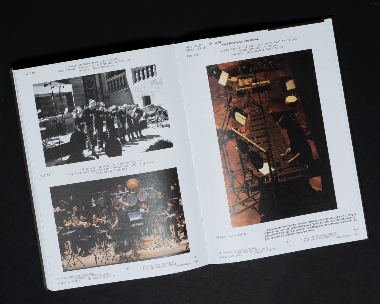


| La Percussion Contemporaine Book | [Right Fig.] Book Cover, Format 230 x 320 mm, 264 Pages | Offset PrintingPrint-run 600 Copies |
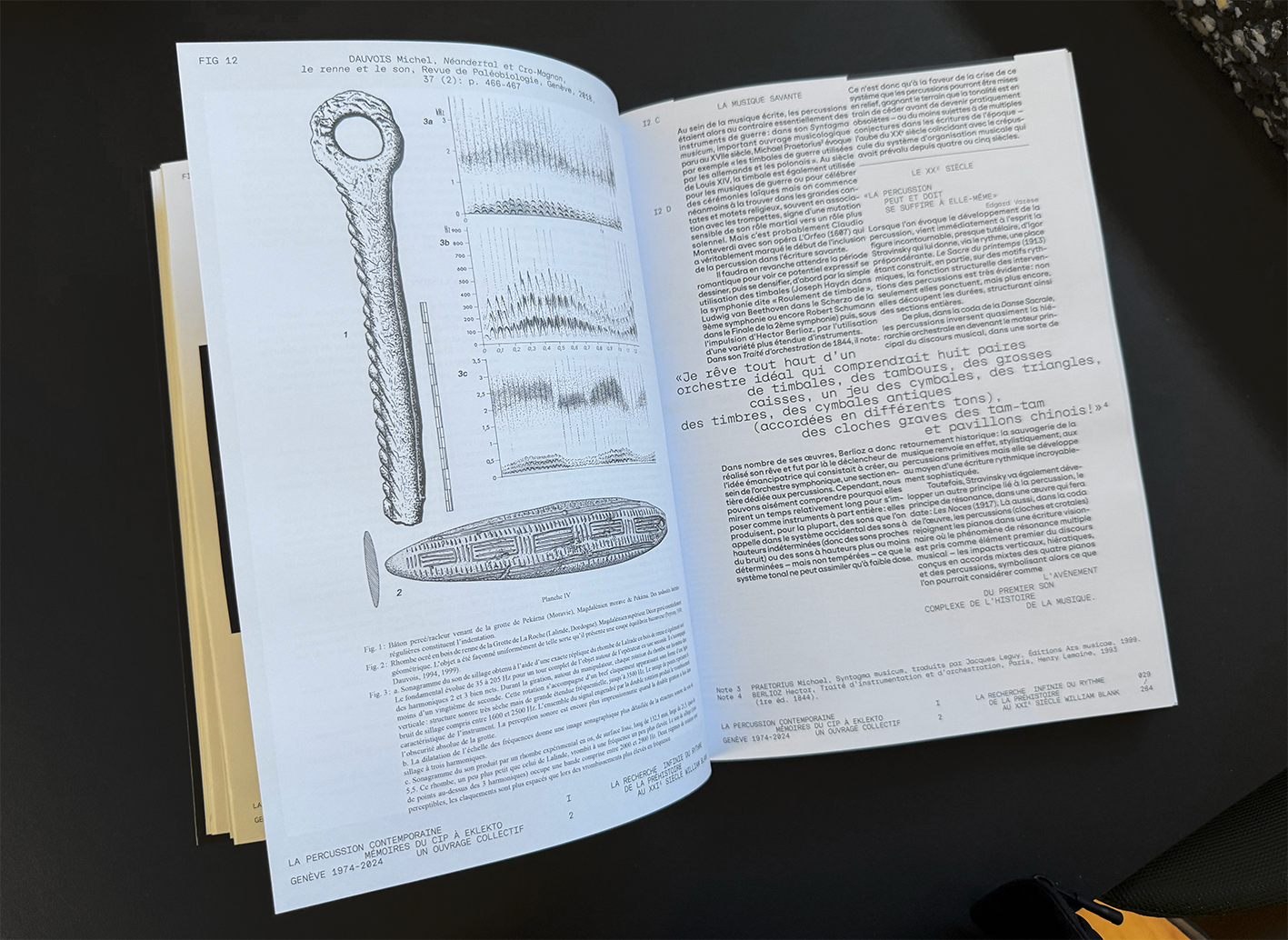 |
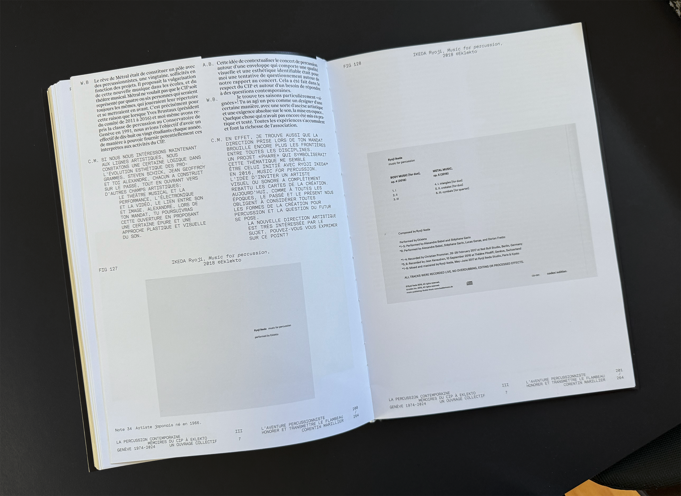 |
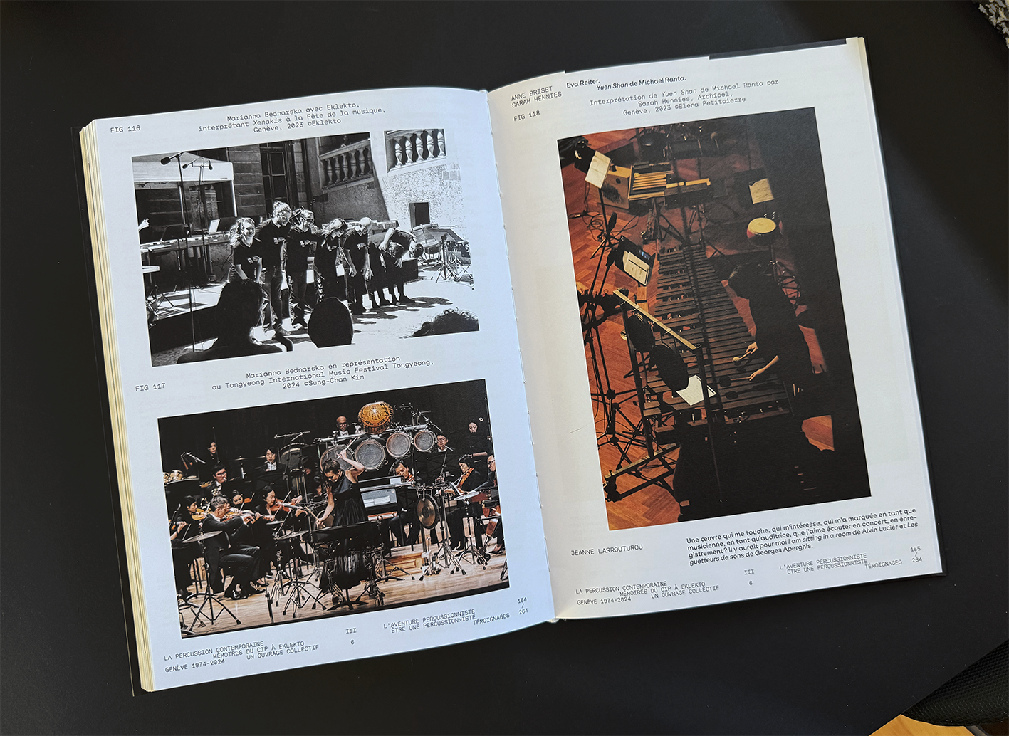 |
| La Percussion Contemporaine Book | Format 230 x 320 mm, 264 Pages | Offset PrintingPrint-run 600 Copies |
 |
 |
 |
 |
 |
 |
 |
 |
 |
| La Percussion Contemporaine Book | Format 230 x 320 mm, 264 Pages | Offset PrintingPrint-run 600 Copies |
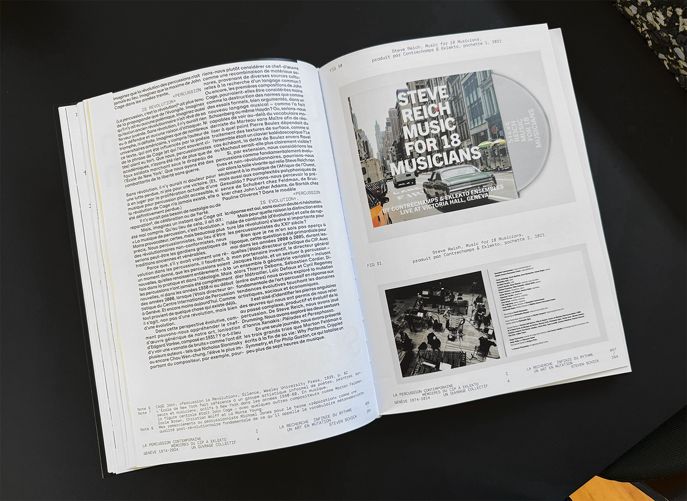
| La Percussion Contemporaine Book | Format 230 x 320 mm, 264 Pages | Offset PrintingPrint-run 600 Copies |
| ES Replan Variform Typeface and Printed Specimen, 2024
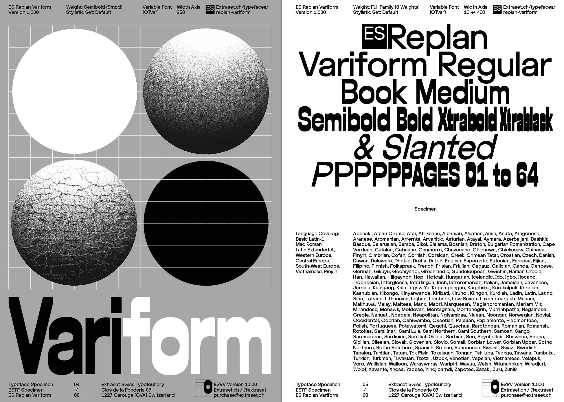
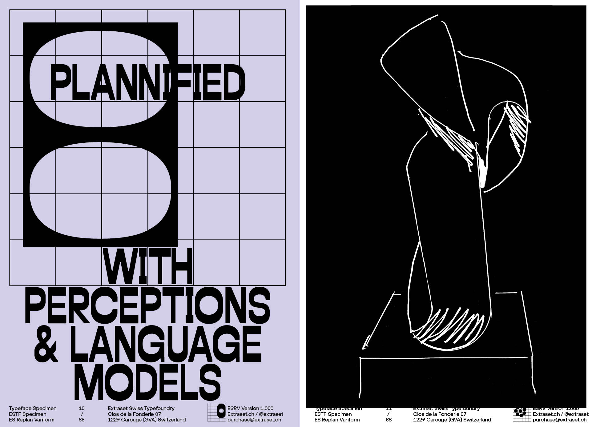
ES Replan Variform is a variable font project that evolves between several typographic structures. The main aim of this typeface is to explore several atmospheres in a single file. Initially experimenting intuitively with an idiosyncratic variable idea in mind, Alex Dujet challenged in a second time drawing solutions to create an eclectic and a functional framework. A Specimen has been conceived to test and showcase the font. The specimen gathers illustration works made by Julien Anet and Dimitri Broquard. |
Organized around the mutation of three masters, the typeface evolves as a versatile, gradually stretching across eight fixed weights (Slanted, Regular 1, Regular 2, Medium, Semibold, Bold, Xtrabold and Xtrablack). In addition to the variable evolution of the typeface, the opentype characteristics contained in the files enable different finishes. Ranging from a selection of uppercases and lowercases to a special set “Replanned”, six open features are selectable to experience different graphic contexts or to satisfy user’s graphic affinities. Clearly created as a tool for graphic tasks, ES Replan Variform is more than just a typeface. | The object is almost oriented towards a language that pays a synthetic tribute to a selection of iconic forms chosen from the fine arts and the design culture.
Typeface Distributor: Extraset Swiss Type Foundry, SARL. Specimen Distributor: Extraset Swiss Type Foundry, SARL Specimen Alone, Specimen + Type Object. United States Distributor: Draw Down Books. 3D Type Object: Conceived by Arno Mathies from ES Replan Varifom Unicode 0052's Opentype Features. |
| ES Replan Variform Specimen | [Left Fig.] Specimen Package, Format 165 x 235 mm, 64 Pages | Offset PrintingPrint-run 300 Copies |
 |
 |
| ES Replan Variform Type Design | [Right Fig.] 0052 + 0052 (SS06) / 004D (Masters) Preview | OTF TTF WOFF WOFF2OTVar Variable Font |
 |
 |
 |
 |
 |
 |
| ES Replan Variform Specimen | Specimen Preview, Format 165 x 235 mm, 64 Pages | Offset PrintingPrint-run 300 Copies |
 |
 |
| ES Replan Variform Posters | Posters Preview, Format 500 x 700 mm, 10 Variations | Silkscreen PrintingPrint-run 10 X 10 Copies |
 |
 |
 |
| ES Replan Variform Posters | Posters Preview, Format 500 x 700 mm, 10 Variations | Silkscreen PrintingPrint-run 10 X 10 Copies |
 |
 |
| ES Replan Variform 3D Object | 0052 + 0052 (SS01 SS02 SS06), Format 165 x 235 mm, 4 Variations | Inox MaterialPrint-run 4 X 15 Copies |
| 1234 Echo Brut 01 + ES Klarheit Plakat Specimen, 2023
1234 Echo Brut 01 is an installation in which Alex Dujet brings together and interweaves graphic, typographic, video, sculptural, and editorial elements. The result of four years of research, the work functions as an open archive where musical references, geometric structures, personal tributes, and reinterpretations of graphic design codes converge. The project originated from an invitation to transform a two-dimensional body of work—posters, prints, typographic grids—into a three-dimensional installation. |
This shift, central to the process, allowed the artist to test graphic design’s ability to change scale, function, and materiality. The starting point is the idea of sequence — 1, 2, 3, 4 — a rhythmic motif borrowed from music. This elementary counting system, present both in musical scores and in layout systems, becomes a structuring principle: four beats, four modules, four words, four letters—units that organize and energize the composition. The project is built around grid systems and strict visual constructions, close to a mathematical logic. These frameworks serve as a foundation before being gradually destabilized, stretched, or opened toward more irregular and organic forms. | 1234 Echo Brut 01 thus embodies an approach in which graphic design becomes a field of transdisciplinary experimentation. Between structural rigor and intuitive drift, the familiar and the strange, the project questions typography’s capacity to produce not only meaning, but also images, rhythms, and objects. Graphic design is no longer a merely functional tool, but a conceptual practice in constant reinvention, where the repetition of “4” becomes a method, a motif, and a creative engine.
Edition Distributor: Extraset Swiss Type Foundry SARL. United States Distributor: Draw Down Books. |


| 1234 Echo Brut 01 Editorial | Exhibition Report Book, Format 210 x 297 mm, 80 Pages | Offset PrintingPrint-run 300 Copies |
 |
 |
 |
 |
 |
 |
| 1234 Echo Brut 01 Editorial | Exhibition Report Book, Format 210 x 297 mm, 80 Pages | Offset PrintingPrint-run 300 Copies |

| 1234 Echo Brut 01 Editorial | Exhibition Report Book, Format 210 x 297 mm, 80 Pages | Offset PrintingPrint-run 300 Copies |
 |
 |
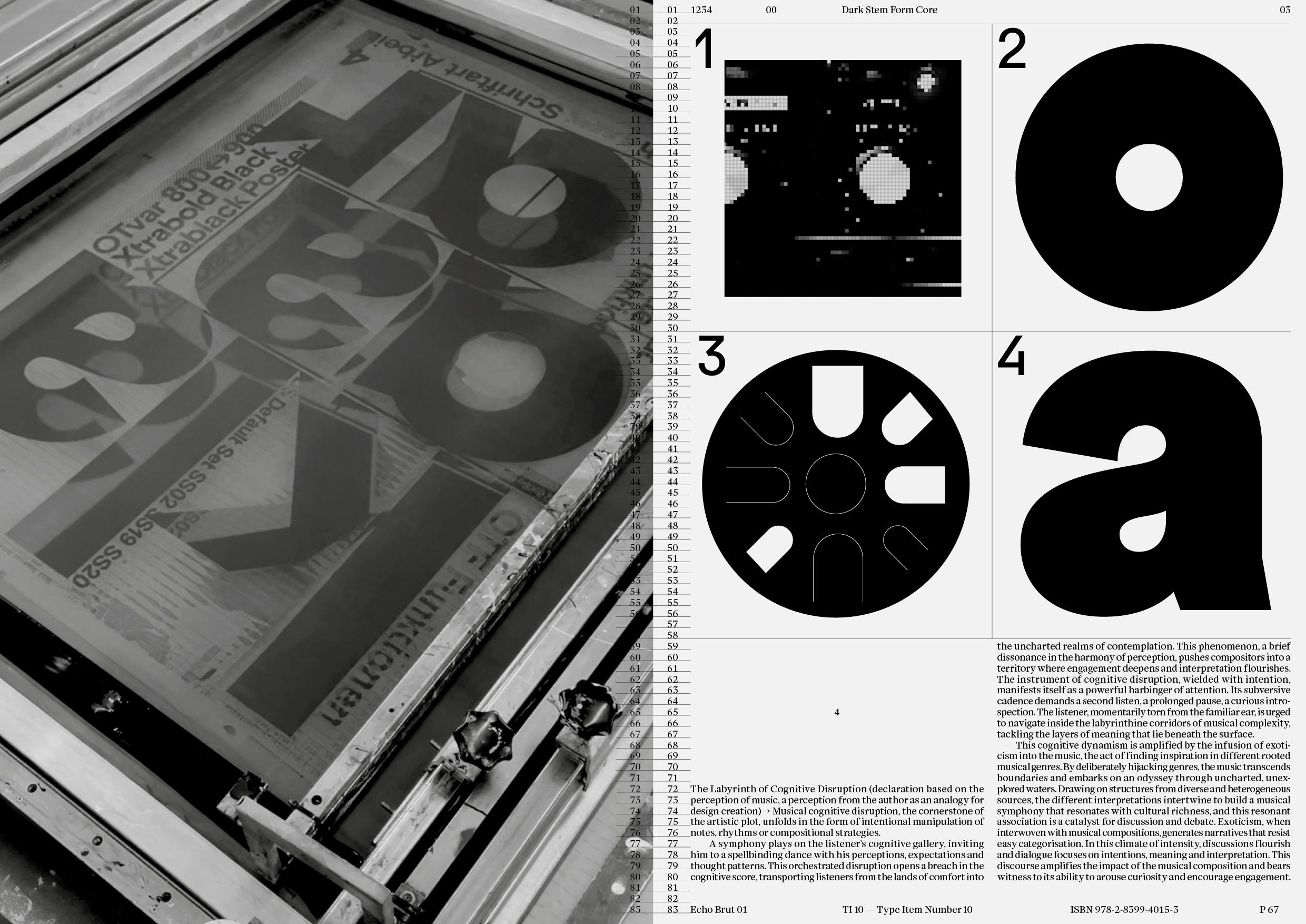 |
| 1234 Echo Brut 01 Editorial | Exhibition Report Book, Format 210 x 297 mm, 80 Pages | Offset PrintingPrint-run 300 Copies |

| 1234 Echo Brut 01 Editorial | Exhibition Report Book, Format 210 x 297 mm, 80 Pages | Offset PrintingPrint-run 300 Copies |
 |
 |
| 1234 Echo Brut 01 Posters | Exhibition Posters, Format 895 x 1280 mm | Silkscreen PrintingPrint-run 50 Copies |
 |
 |
| 1234 Echo Brut 01 Sculptures | [Left Fig.] Ozzy Sculpture, [Right Fig.] Drum Kit Sculpture | 3D Printing / CNC 1 Copy |
| ES Klarheit Plakat Typeface (Specimen, Posters & Shirt)
Klarheit Plakat takes shape from the multiple possibilities of the flagship Klarheit Grotesk project, and its sub-family the Kurrent version. Beyond these 4 extrapolations (Extrabold, Black, Extrablack, Poster) ES Klarheit Plakat functions as a synthesis orchestrated by the particular finishes of the Grotesk and Kurrent versions. |
Plus, other radical decisions defined onoverall Klarheit package, Alex Dujet has come up with a playful tool for bold titlings, or composing small amounts of text. ES Klarheit Plakat includes 11 stylistic sets taken from the basic sets of the initial versions of Klarheit Grotesk and Kurrent, and an extension of 9 sets that brings more or less expression to the typeface. This palette is organized to provide a logical framework when experiencing with the typeface. The default set of the font takes source from the Kurrent style and works | as an assertive looking. The progression evolves through the “schoolbook” mode, rounded or squared dots and punctuation, ligatures options, more ampersands, and the list concludes with a Grotesk-oriented vision. A very, very, very, very, bold tool available at Extraset.
Typeface Distributor: Extraset Swiss Type Foundry SARL. Specimen Distributor: Extraset Swiss Type Foundry SARL. Specimen United States Distributor: Draw Down Books. |
| ES Klarheit Plakat Mini Specimen | [Left Fig.] Specimen Preview, Format 165 x 235 mm, 16 Pages | Offset Printing 300 Copy |
|
|

|


| ES Klarheit Plakat Specimen | [Right Fig.] Folded Poster, Format 500 x 700 mm | Offset Printing 300 Copy |

| ES Klarheit Plakat Type Design | 4 Weights, 20 Stylistic Sets | OTF TTF WOFF WOFF2 OTVar Variable Font |

|

|
| ES Klarheit PlakatPosters | Specimen Posters, Format 895 x 1280 mm | Silkscreen PrintingPrint-run 50 Copies |
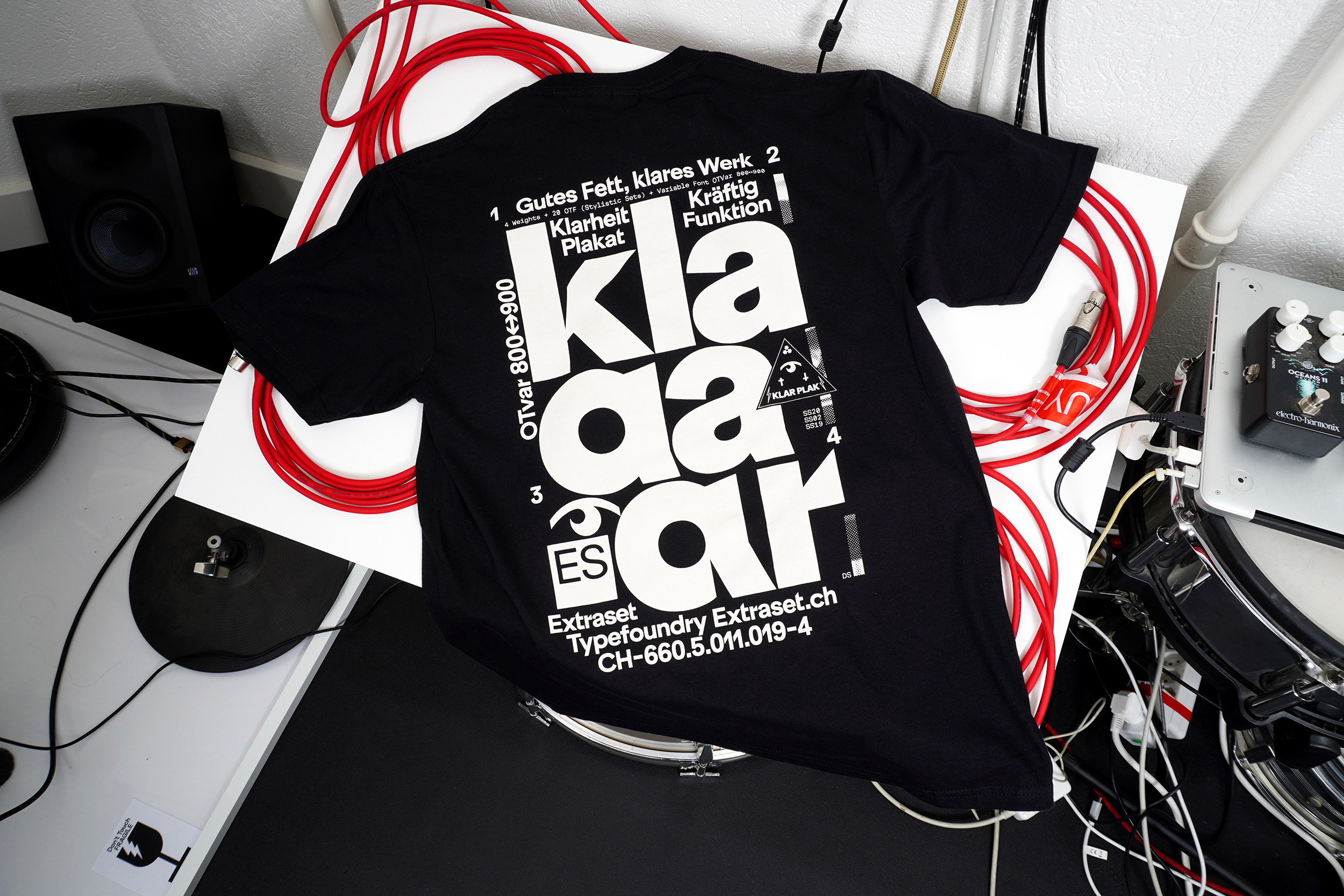
| ES Klarheit Plakat Shirt | Specimen Shirt, Sizes S, M, L, XL | Silkscreen PrintingPrint-run 50 Copies |
| ES Klarheit Grotesk Mono Typeface, 2023
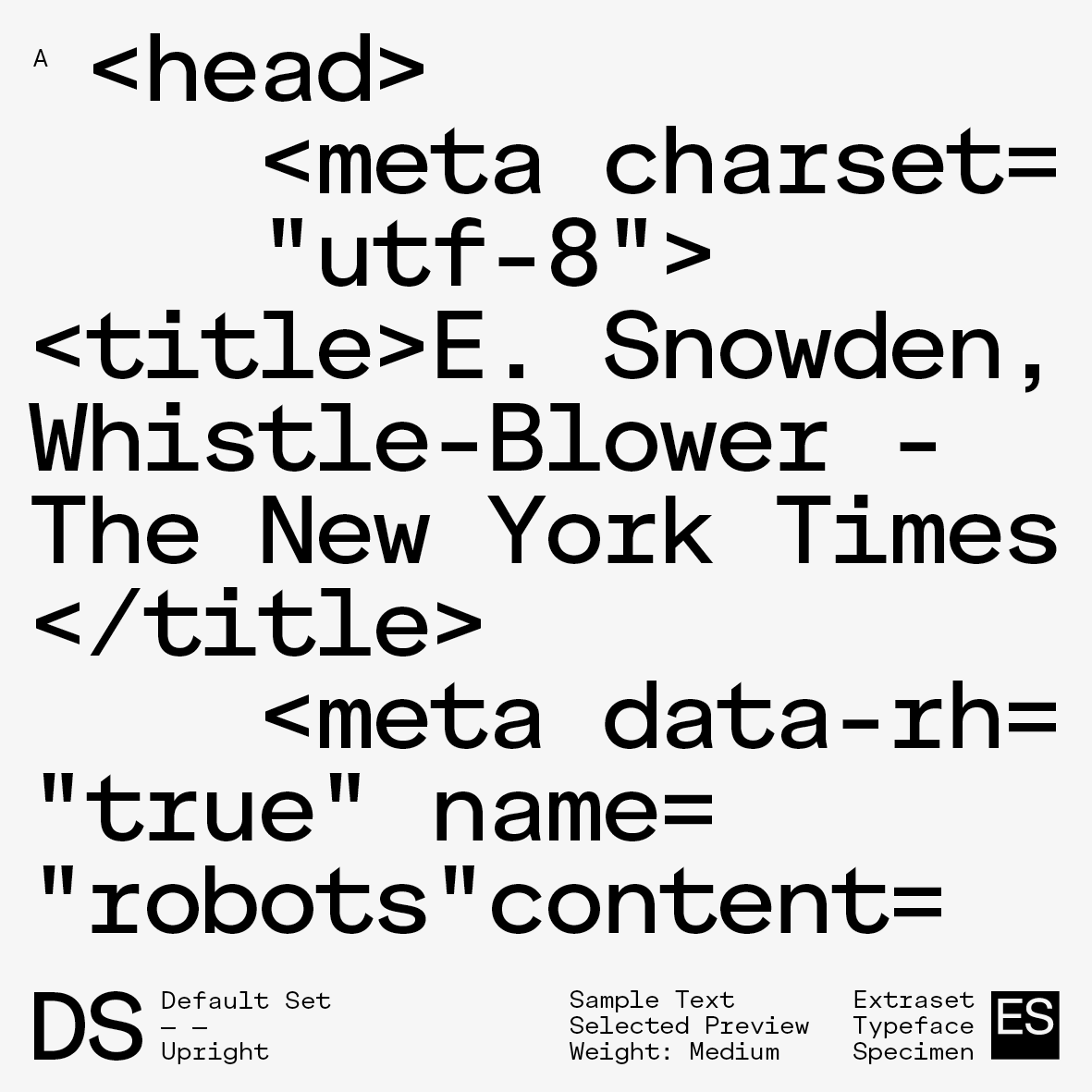
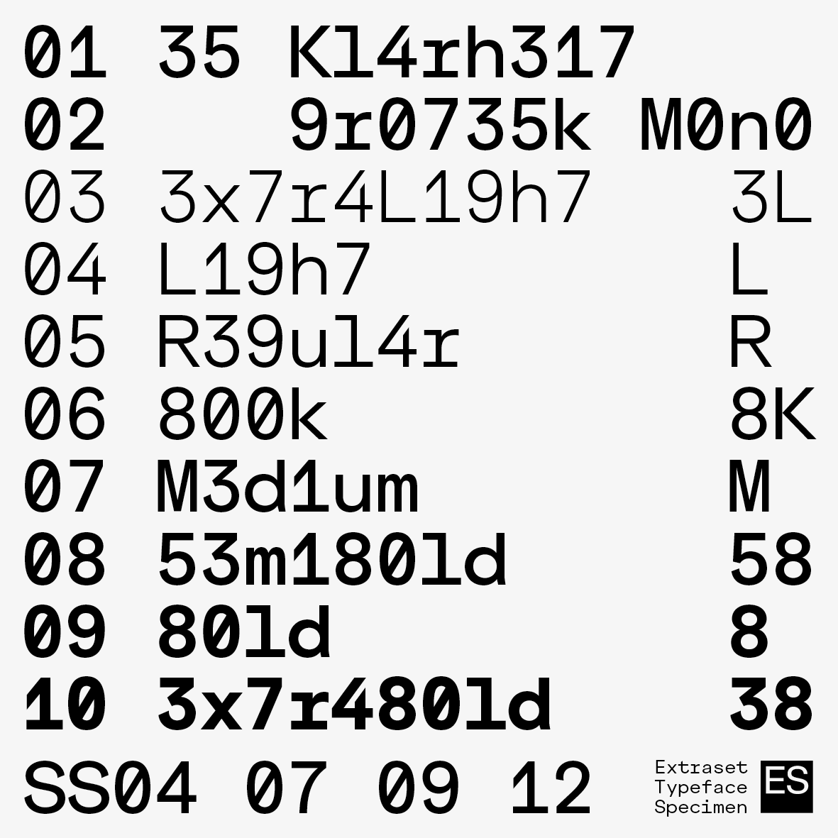
ES Klarheit Grotesk Mono is a supplementary option oscillating identically between the two initial major standards present in the initial family. |
Klarheit project seeks to meet the requirements of a more contemporary form of modernism, and features a formula that revisits geometrical solutions drawn from the Bauhaus movement as well as key typographic standards used in 1960s Swiss modernism. Following these fundamentals, Alex Dujet applied a monocase version to the formula. The OpenType possibilities include 12 versatile stylistic sets that feature a variety of finishes and that matches with the proportional version. | The many possible combinations through the use of this palette allow for progressive design choices oscillating between neutral and more assertive graphic positioning. ES Klarheit Grotesk Mono is a useful tool to maximize vertical text alignment requirements.
Typeface Distributor: Extraset Swiss Type Foundry SARL. |
| ES Klarheit Grotesk Mono Type Design | 8 Weights + Related Italics, 12 Sets | OTF TTF WOFF WOFF2 OTVar Variable |

|

|
| ES Klarheit Grotesk Mono Type Design | 8 Weights + Related Italics, 12 Sets | OTF TTF WOFF WOFF2 OTVar Variable |
 |
 |
 |
| ES Klarheit Grotesk Mono Type Design | 8 Weights + Related Italics, 12 Sets | OTF TTF WOFF WOFF2 OTVar Variable |
 |
 |
 |
| ES Klarheit Grotesk Mono Type Design | 8 Weights + Related Italics, 12 Sets | OTF TTF WOFF WOFF2 OTVar Variable |
| ES Klarheit Kurrent Mono Typeface, 2023
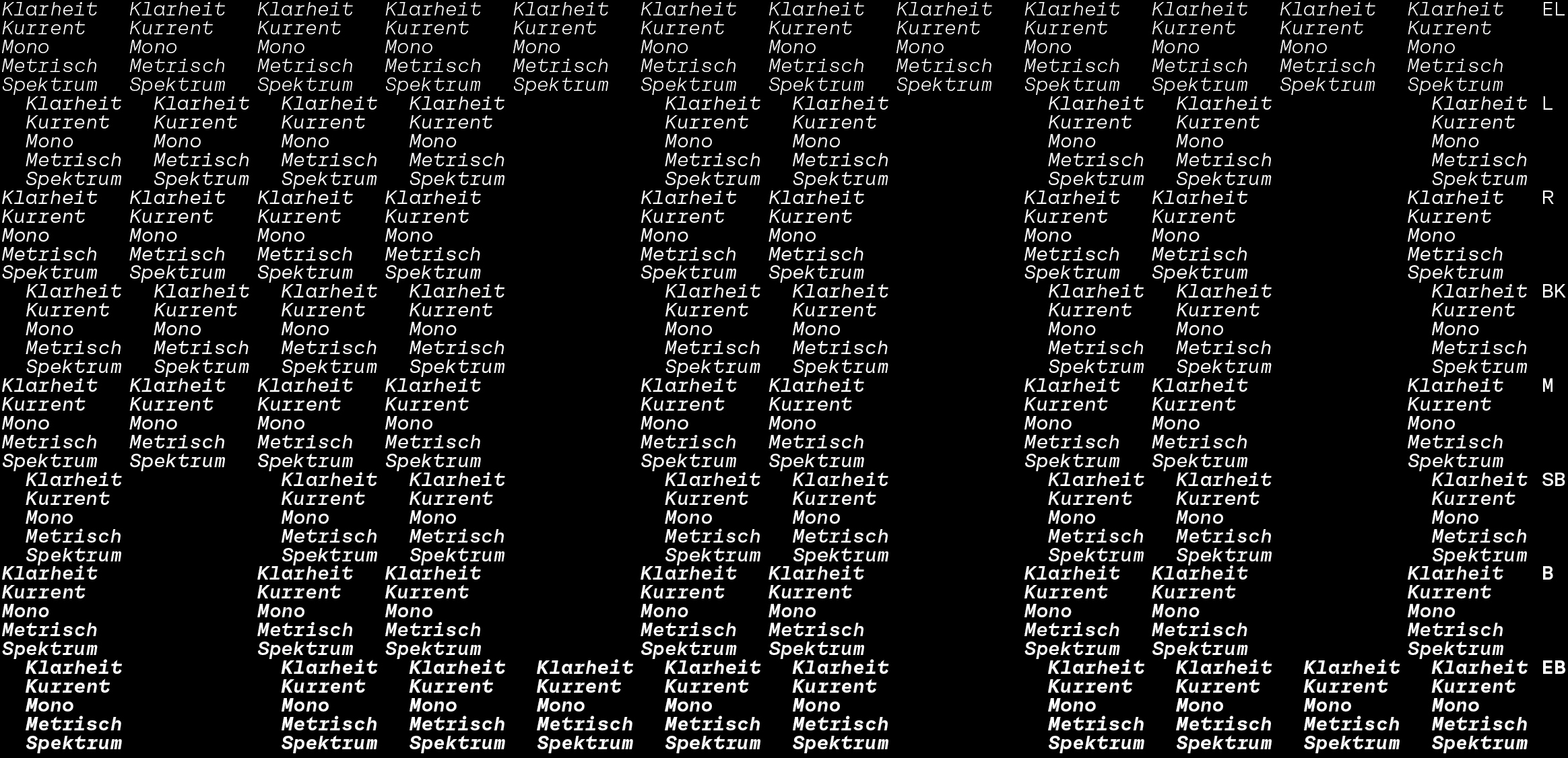
In the same way of the Grotesk version of the Klarheit Family, ES Klarheit Kurrent Mono appears as an inevitable cut. Oscillating identically with its mother ship ES Klarheit Kurrent, this mono version allows a supplementary option that seeks to meet the necessary demands of a powerful and original tool. |
Depending on the graphic context, this project enhances the authenticity of an atypical and a radical atmosphere. Indeed, some letters offer an extra step in terms of design, more incisions are present in the font than the Grotesk version. Also designed to echo modernism and geometrical standards, Alex Dujet’s choice was to not include a large stylistic sets panel. | The designer has just turning the dots diacritics in a round shape and options for “MWw” & “r” letters). Same as ES Klarheit Grotesk, ES Klarheit Kurrent Mono is a useful tool to maximize vertical text alignment requirements. A product available as a full family.
Typeface Distributor: Extraset Swiss Type Foundry SARL. |
| ES Klarheit Kurrent Mono Type Design | 8 Weights + Related Italics, 3 Sets | OTF TTF WOFF WOFF2 OTVar Variable |
| ES Klarheit Kurrent MonoType Design | 8 Weights + Related Italics, 3 Sets | OTF TTF WOFF WOFF2 OTVar Variable |

|

|
| ES Klarheit Kurrent MonoType Design | 8 Weights + Related Italics, 3 Sets | OTF TTF WOFF WOFF2 OTVar Variable |
| ES Face Typeface, 2022
Face is a serif typeface that balances the heritage of the transitional typefaces that originated around the 18th century with contemporary design finishes of our time. With a view to creating a specific tool for optimal reading comfort for commercial word processing, Alex Dujet developed the first structures of the design in 2016. |
Keeping in mind the need to develop an incisive and contemporary project, the designer has focused in recent years on different stylistic sets and partially geometric drawing: a necessity in order to offer radical solutions to some of the terminals of the typeface when using it for titling. The available OpenType options allow a versatile oscillation of the character. Two main sets have been defined in order to parameterise the use of the tool according to the needs and desires, atmospheres and graphic affinities of the design subjects to be treated. | Face offers a default set articulating the ends of its terminals in the form of drops, and a set called “straight” focusing on the finishes of certain straight letters for a sharper design look. The design around the italic offers an assertive cutting angle in the centre of the stems of some letters to highlight the words treated in long lengths of composition.
Typeface Distributor: Extraset Swiss Type Foundry SARL. |
| ES FaceType Design | 10 Weights + Related Italics, 4 Sets | OTF TTF WOFF WOFF2 OTVar Variable |


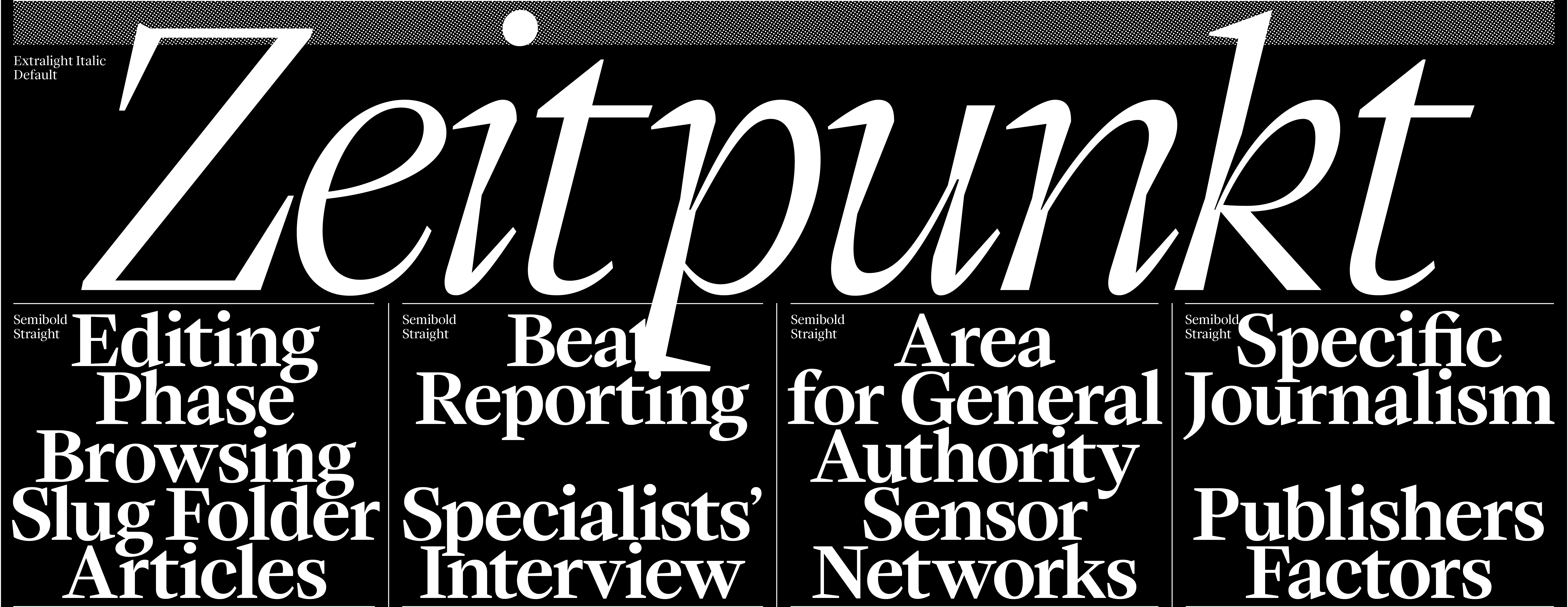
| ES Face Type Design | 10 Weights + Related Italics, 4 Sets | OTF TTF WOFF WOFF2 OTVar Variable |
| Graphic Design and Cultural Diplomacy Flyer An exhibition at the Musée Dynamique in Dakar under review: La Suisse présente la Suisse (26.11-1971 – 29.02.1972), 2018 A project made for the researcher Daniel Siboz in the frame of a research event held by HEAD – Geneva. |
Presence Switzerland in Senegal: on the role of graphic design in the making of an exhibition at the Dynamic Museum in Dakar(HES-SO 2019-2020)aims to identify possible interpretations for the history of graphic design by analysing the design and production of the exhibition La Suisse présente la Suisse (26.11.1971 - 29.02.1972). Part of this project,two study days intend to provide a state of the ongoing investigations into archives available at the Swiss Federal Archives in Bern and the Museum of | Ethnography in Neuchâtel, and to share intermediary reports including research done by the Swiss Graphic Design and Typography Revisited(FNS 2016–2019). On the one hand, the study days will provide a more accurate understanding of the transnational and postcolonial contexts of this exhibition and, on the other hand, lead to discuss the methodological approach of this research.
Client: Daniel Siboz HEAD – Geneva (Switzerland), 2019 |
| Graphic Design and Cultural Diplomacy Flyer | [Left Fig.] Flyer (Folded), Format 297 x 420 mm | Offset PrintingPrint-run 300 Copies |

|

|
| Graphic Design and Cultural Diplomacy Flyer | [Right Fig.] Inside Detail, Format 297 x 420 mm | Offset PrintingPrint-run 300 Copies |

| Graphic Design and Cultural Diplomacy Flyer | Flyer (Outside), Format 297 x 420 mm | Offset PrintingPrint-run 300 Copies |

| Graphic Design and Cultural Diplomacy Flyer | Flyer (Inside), Format 297 x 420 mm | Offset PrintingPrint-run 300 Copies |
| ES Klarheit Grotesk Typeface, 2020
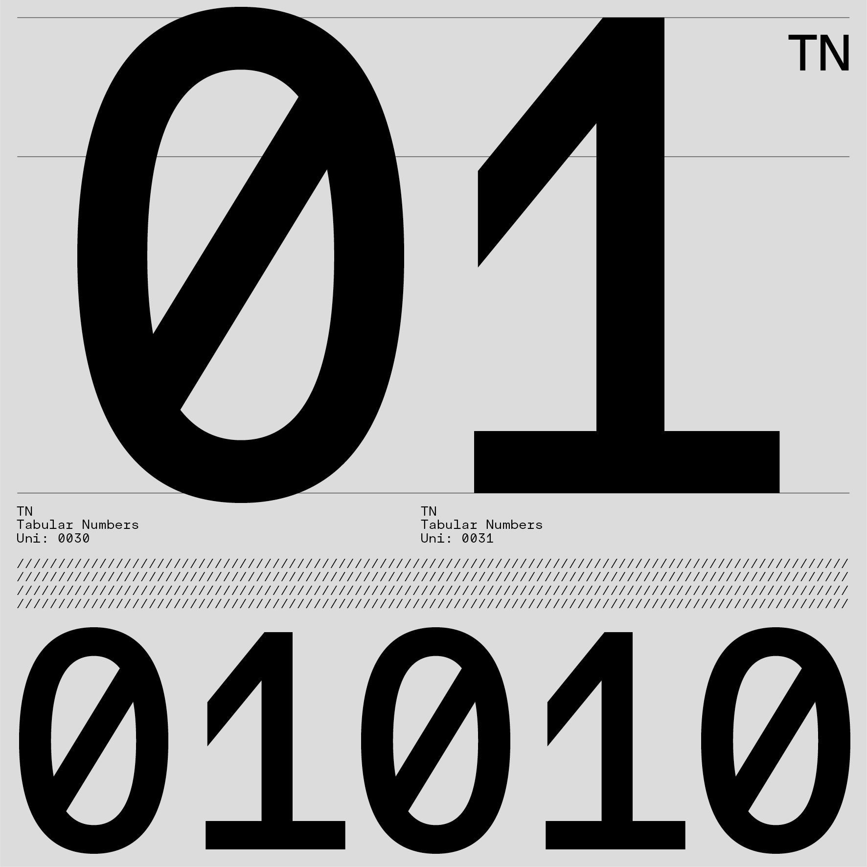
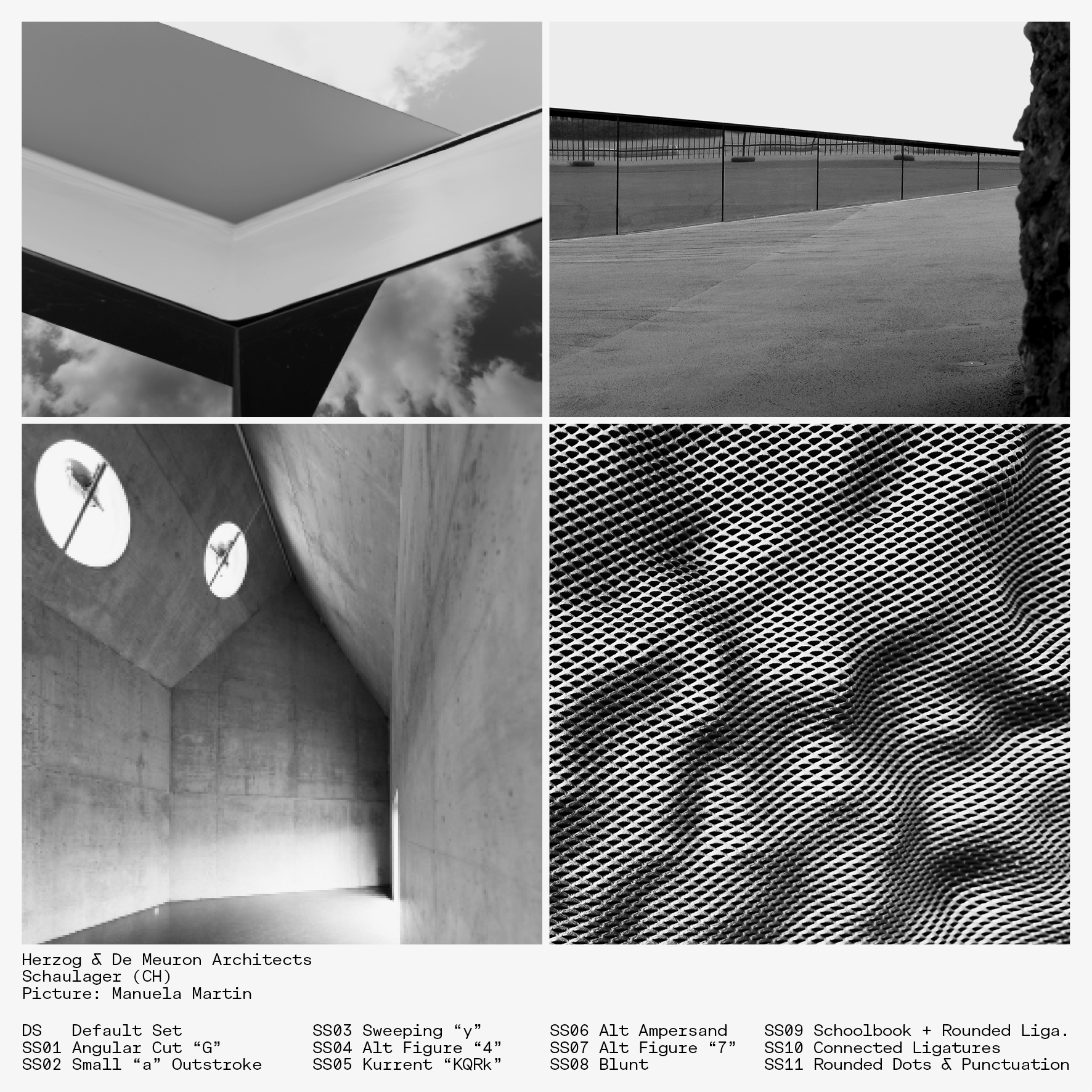
Oscillating between two major standards, ES Klarheit Grotesk seeks to meet the requirements of a more contemporary form of modernism. The project features a formula that revisits geometrical solutions drawn from the Bauhaus movement as well as key typographic standards used in 1960s Swiss modernism. |
After five years of work and various experiments with this tool, Alex Dujet has come up with several finishing touches revolving around the global structure of its basic design. Several frameworks have thus been defined combining consistent historical periods with great readability and glyph precision when using this font for text as well as headlines. | With this in mind, the OpenType possibilities include 13 versatile stylistic sets that feature a variety of finishes. The many possible combinations through the use of this palette allow for progressive design choices oscillating between neutral and more assertive graphic positioning.
Typeface Distributor: Extraset Swiss Type Foundry SARL. |
| ES Klarheit GroteskType Design | 8 Weights + Related Italics, 13 Sets | OTF TTF WOFF WOFF2 OTVar Variable |

|

|
| ES Klarheit GroteskType Design | 8 Weights + Related Italics, 13 Sets | OTF TTF WOFF WOFF2 OTVar Variable |

| ES Klarheit GroteskType Design | 8 Weights + Related Italics, 13 Sets | OTF TTF WOFF WOFF2 OTVar Variable |
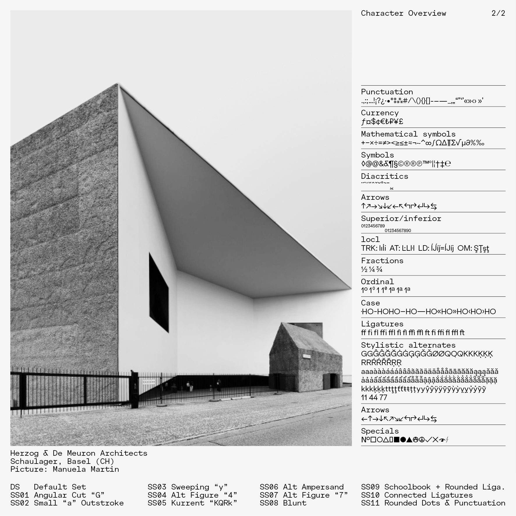 |
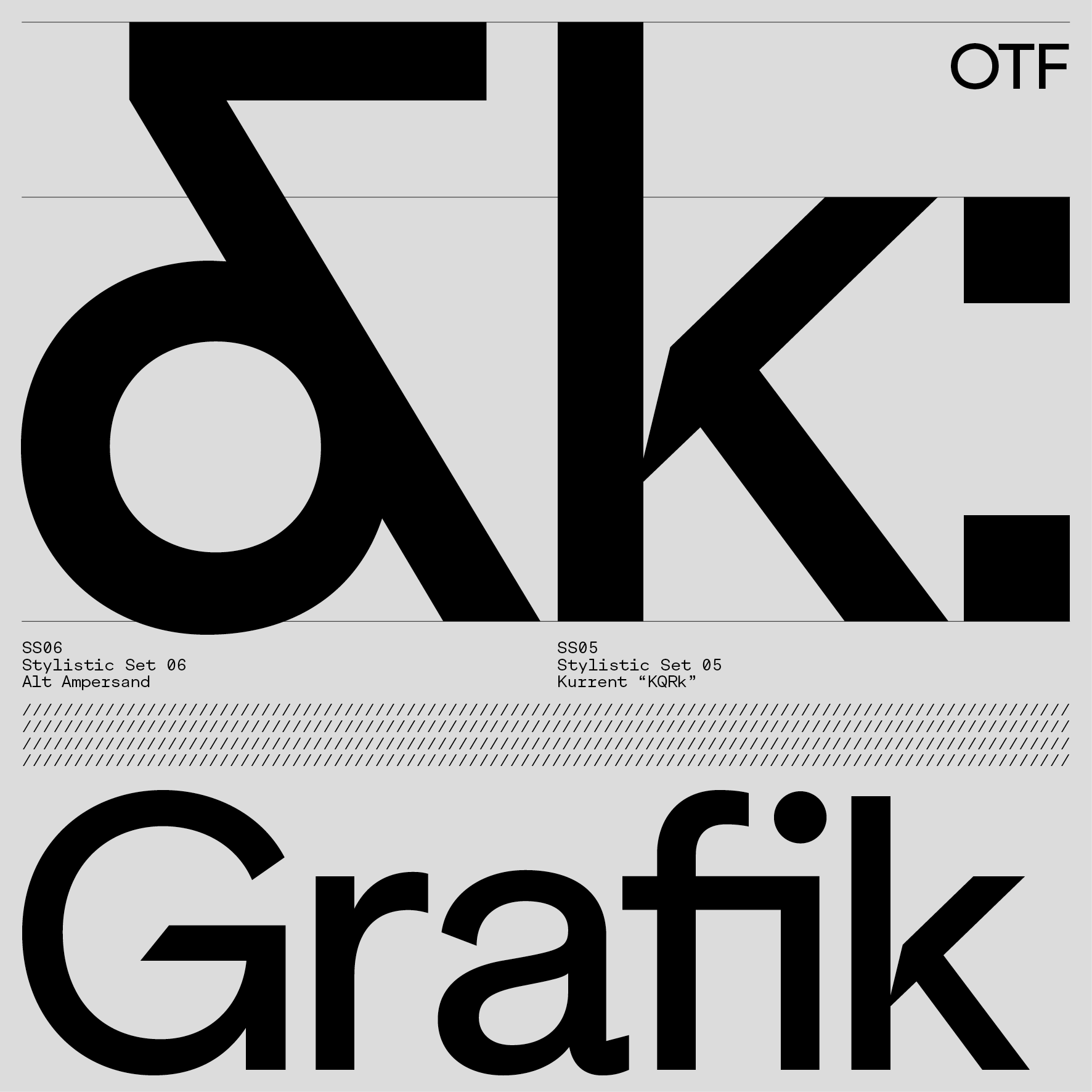 |
 |
 |
 |
 |
| ES Klarheit GroteskType Design | 8 Weights + Related Italics, 13 Sets | OTF TTF WOFF WOFF2 OTVar Variable |
| ES Klarheit Kurrent Typeface, 2020
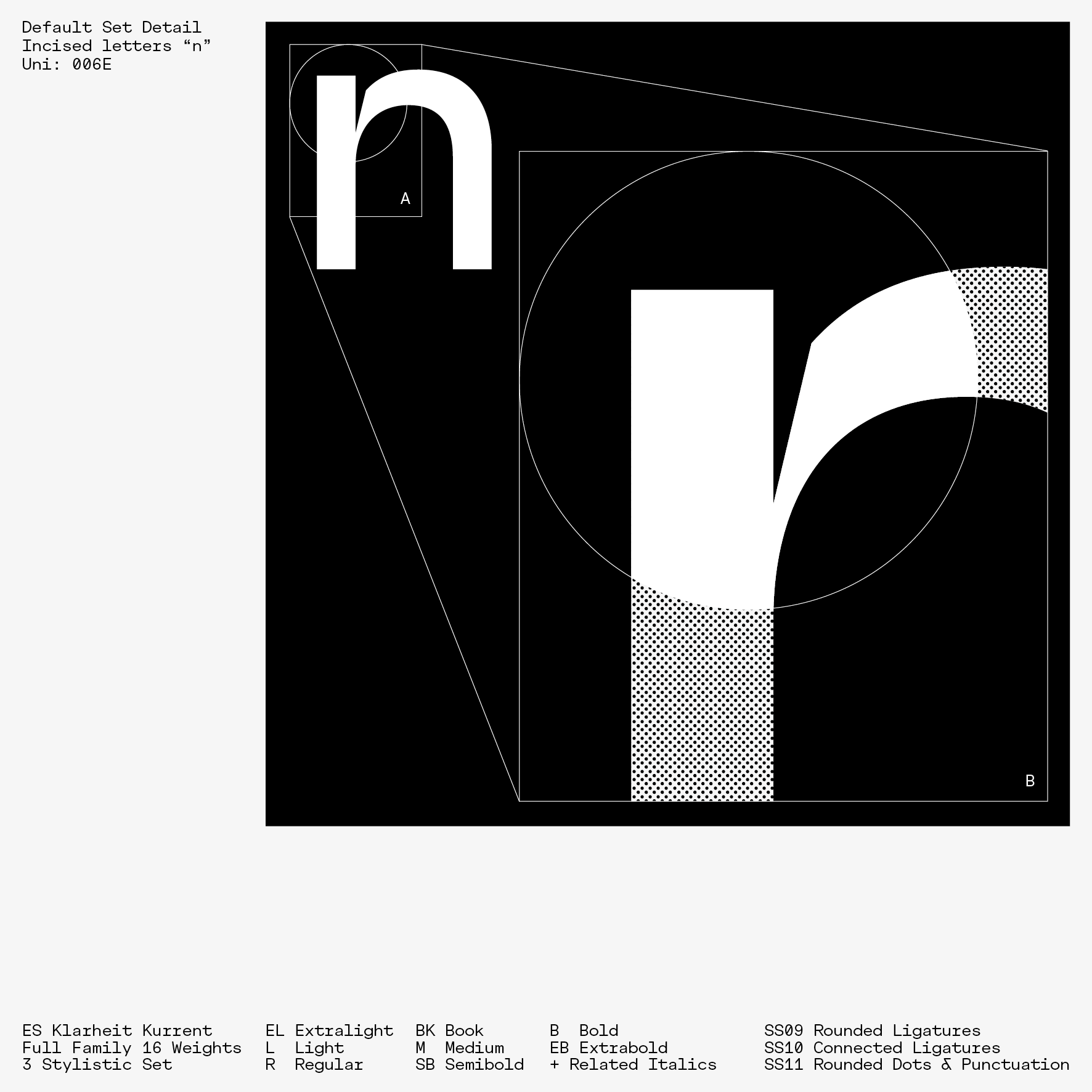
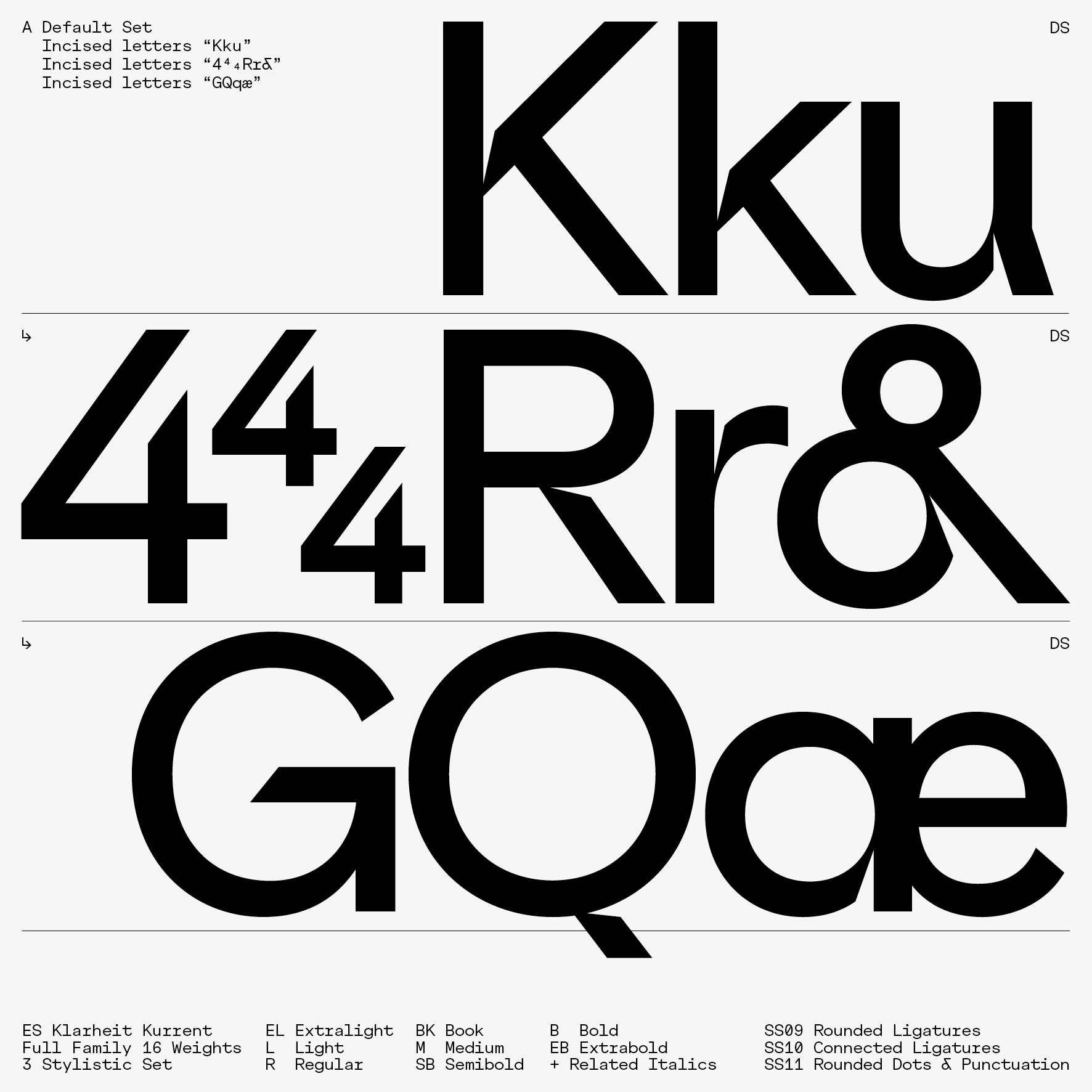
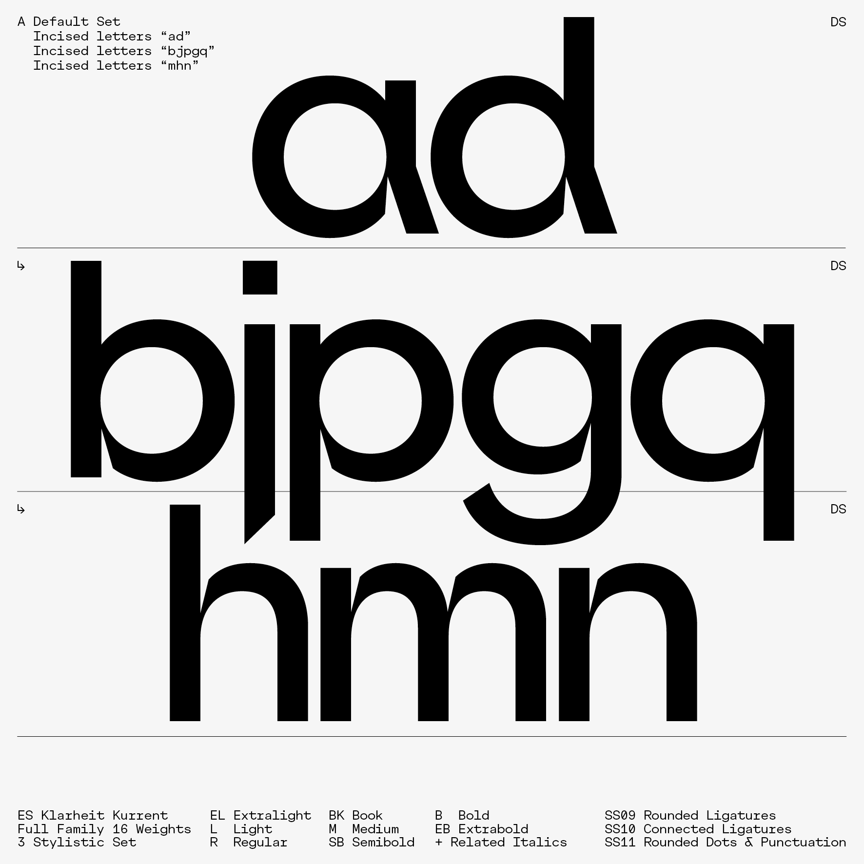
Right after the ES Klarheit Grotesk experiment, ES Klarheit Kurrent emerged as an instinctive decision revolving around Alex Dujet’s graphic and typographic work. Developed based on the structures of its parent ES Klarheit Grotesk, this variant seeks to meet the necessary demands of a powerful and original tool. |
The aim of the project enhances the authenticity of headlines and provides an atypical atmosphere when using this font for work tasks. Indeed, some letters offer an extra step in terms of design, more incisions are present in the font. Also designed to echo modernism and geometrical standards, ES Klarheit Kurrent nevertheless does not include a stylistic set (unless turning the dots diacritics in a round shape and some ligatures options). | The project only focuses on a single decision in opposition to the manifold possibilities of the flagship ES Klarheit Grotesk project, a radical choice that features extreme cuts in the finishes of some of the components of the basic alphabet, in order to outline an authentic approach when developing communication projects of all types.
Typeface Distributor: Extraset Swiss Type Foundry SARL. |
| ES Klarheit KurrentType Design | 8 Weights + Related Italics, 3 Sets | OTF TTF WOFF WOFF2 OTVar Variable |

|

|
| ES Klarheit KurrentType Design | 8 Weights + Related Italics, 3 Sets | OTF TTF WOFF WOFF2 OTVar Variable |

|

|
| ES Klarheit KurrentType Design | 8 Weights + Related Italics, 3 Sets | OTF TTF WOFF WOFF2 OTVar Variable |
 |
 |
 |
| ES Klarheit KurrentType Design | 8 Weights + Related Italics, 3 Sets | OTF TTF WOFF WOFF2 OTVar Variable |

|

|
| ES Klarheit KurrentType Design | 8 Weights + Related Italics, 3 Sets | OTF TTF WOFF WOFF2 OTVar Variable |
| ES Quarz Typeface, 2020
Quarz is a spontaneous and instinctive project that deals with the Didone typeface field. By classifying this project as a hybrid more than a classic Didot, the main idea was to create something that cracks intensively to design distinguished headlines. |
The finality looks mainly like a Didot at first sight, but then there are details taken from the American 70s design. The quirky design aesthetic came from a vision to link some glyphs together. The idiosyncratic Didone’s serifs have been revisited along this project to partially create a unique chain of successive ligatures depending on the combinations of letters. | The project features 5 opentype stylistic sets, plus some additional discretionary or contextual ligatures, and allows to work with automatic swashes positional forms to embellish your titling.
Typeface Distributor: Extraset Swiss Type Foundry SARL. |
| ES QuarzType Design | 1 Weight, 5 Sets | OTF TTF WOFF WOFF2 Headline Font |

| ES QuarzType Design | 1 Weight, 5 Sets | OTF TTF WOFF WOFF2 Headline Font |
| Type Item #8 Taxonomie, 2017
Made during Alex Dujet's teaching activities validation, this project was conceived in regard to the graphic design and typography education field. Structured around several experiments from the author, the project offers theoretical essays as well as various design experiments. |
An apprenticeship program has been planned around Benjamin Bloom's taxonomy theory, and this by methodically using fundamentals Swiss graphic design references. Benjamin Bloom's taxonomy (1956) classifies cognitive learning objectives into six levels, ranging from the simplest (C1, at the bottom of the pyramid) to the most complex (C6, at the top of the pyramid). | A set of action verbs corresponds to each level. These verbs not only allow us to identify a learning objective precisely, but also to formulate the objectives of learning activities more clearly in terms of “ability to.” A learning objective is usually defined by an action verb. It is by progressing from level C1 to level C6 that this edition will take on meaning. |
| Type Item #8 Taxonomie Education | [Left Fig.] Specimen Cover, Format 210 x 297 mm, 32 Pages | Offset PrintingPrint-run 300 Copies |
|
|

|


| Type Item #8 Taxonomie Posters | [Right Fig.] Book Spine, Format 240 x 320 mm, 300 Pages | Offset PrintingPrint-run 30 Copies |

| Type Item #8 Taxonomie Editorial | Book, Format 240 x 320 mm, 300 Pages | Offset PrintingPrint-run 30 Copies |
 |
 |
 |
| Type Item #8 Taxonomie Editorial | Book, Format 240 x 320 mm, 300 Pages | Offset PrintingPrint-run 30 Copies |

| Type Item #8 Taxonomie Editorial | Book, Format 240 x 320 mm, 300 Pages | Offset PrintingPrint-run 30 Copies |

| Type Item #8 Taxonomie Posters | Poster, Format 895 x 1280 mm | Silkscreen PrintingPrint-run 50 Copies |

| Type Item #8 Taxonomie Posters | Poster, Format 895 x 1280 mm | Silkscreen PrintingPrint-run 50 Copies |
| ES Nein, 2020
Nein is a project that reinterprets certain characteristics drawn from the heritage of wood types. The first components of this extra-bold, highly condensed version 2.0 were developed a few years before it was launched on Extraset Type Foundry in 2020. |
The design of the tool is based on classics of the genre and right after its birth, the type was tested in several commissions. Nein offers two stylistic sets which add diversity to the details. The default set clearly refers to the style of wood type thanks to some impressive diagonal features, whereas the ink traps stylistic set offers a lighter contrast with regards to the very black components of the basic set. | The relatively large development of the typeface (Latin Extended-A) has driven the designer to decide to distribute this version in order to enable the possibility of composing assertive subjects.
Typeface Distributor: Extraset Swiss Type Foundry SARL. |
| ES NeinType Design | 1 Weight, 2 Sets, [Left Fig.] Default Set | OTF TTF WOFF WOFF2 Headline Font |

| ES NeinType Design | 1 Weight, 2 Sets, [Right Fig.] Inktraps Set | OTF TTF WOFF WOFF2 Headline Font |
Disclaimer: This website and its content is copyright of Alex Dujet. Any redistribution or reproduction of part or all of the contents in any form is prohibited. You may not, except with our express written permission, distribute or commercially exploit the content. Nor may you transmit it or store it in any other website or other form of electronic retrieval system without the prior written permission of Alex Dujet Type System Corp. All RIght Reserved ©Alex Dujet, 2026.